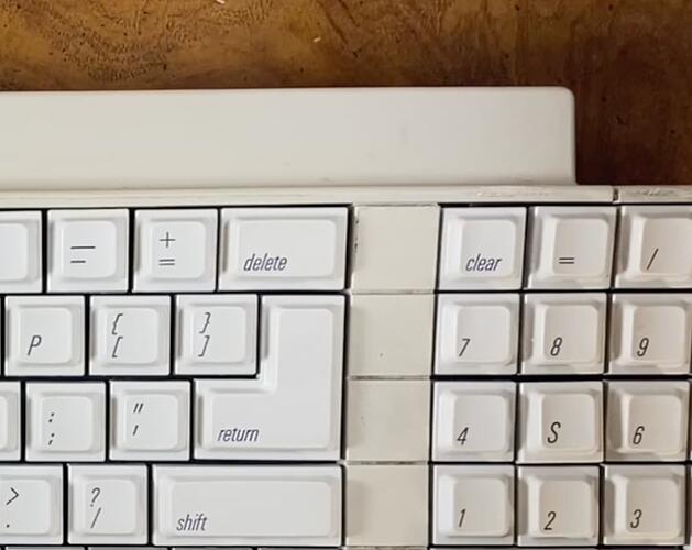
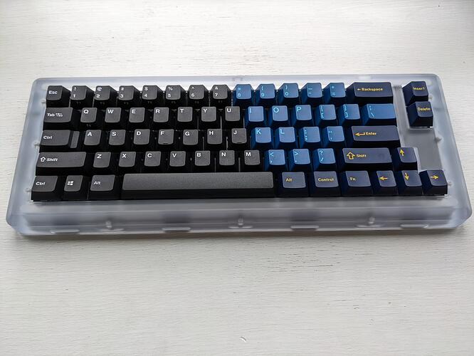
I like a mix of the two. Flat caps or blockers on the top 2 rows in the middle and normal keycaps on the bottom 2 rows. I also like the top setup with the blockers in the middle, kind of reminds me of the apple ADB keyboard (I think thats the one with the square blocker-like things that separate the numpad?).
Yeah I got the caps from an IIgs keyboard, which does have this divider that looks kinda like blockers, although it’s one piece of plastic. Although I wasn’t even thinking of imitating that OG style, PMK does sell ever-so-slightly off-white F10 caps, maybe that might look quite good…
Visually I prefer the top one. It is also less confusing for me to look at as the black breaks things up.
Top all the way and twice on sundays
^
What he said
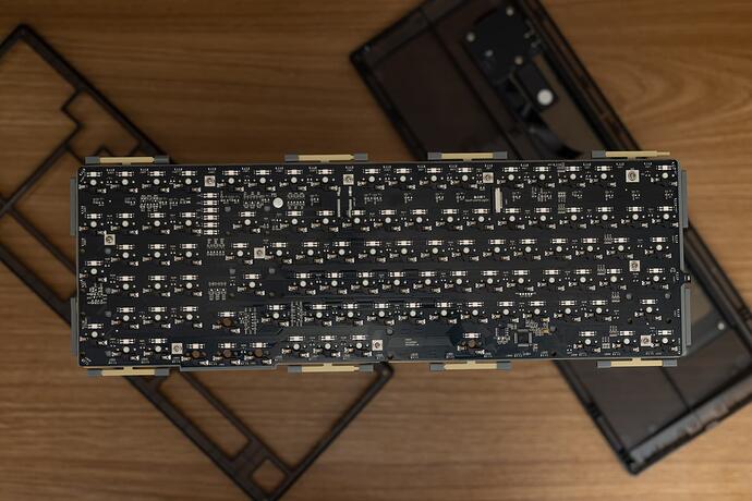
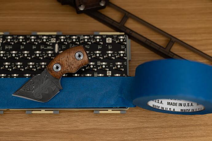
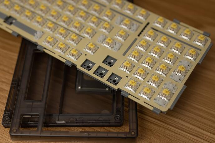
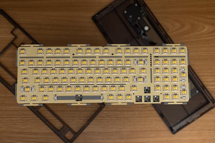
Working on MX setup for H6 case using the stock FC660m plate. I was quite determined to get this square peg in a round hole…
More Details: https://imgur.com/a/MOReMm4
Why go through all the trouble: The H6 case was expensive wanted to get the most out of it. I like both MX and Topre. There is not as much variety of Topre keycaps (at least that are not HHKB)
Some more tweaks are needed for LEDs and decide on a final switch and keycap. Maybe MX Zilents to change things up.
Okay, cool… but MY EARS.
Big mod big noise 
When I am at a PC and remove the noise make it quieter.

Thanks for the unanimous feedback guys, I think you’ve convinced me: I’ll go split!
I’ve come to prefer split, it’s less visually confusing if I need to glance down for a quick tap or combo. Also, less is better! Usually. I keep three mods on the left for my gaming layer.
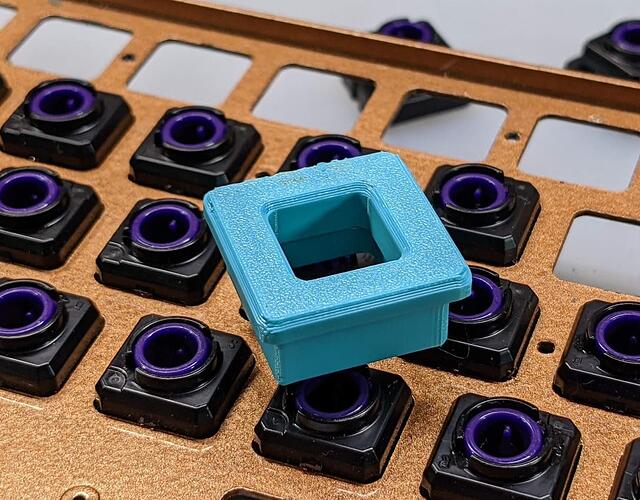
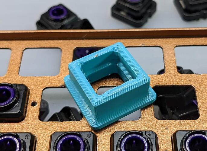
I took a couple minutes today to design a tool to help pop out Topre Housings faster and I’m pleased to say it works pretty well. I intend to refine this so I can do it in one motion, but the two step process right now is so much faster than how I was doing this before.
https://www.printables.com/model/224182-topre-housing-popper
Awesome! I’ll print this tonight 
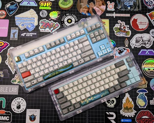
The paint on the FC660C switch plate cured finishing the transition from Copper to a blue green. It patina’d if you will.
I also added the wood/resin spacebar and different colored ceramic keys to match the plate a little better.
Then, because the work bench was finally clearing off, I took a picture of the both of them for comparison.
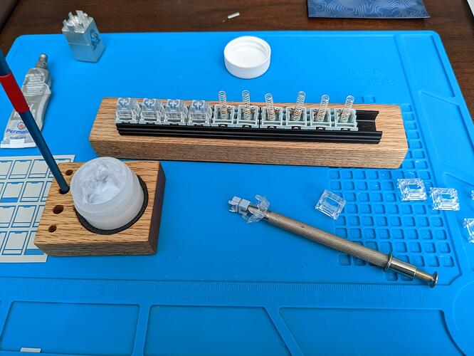
Lubing bluish whites.
My first time with the very long 2 stage springs and box stems. Experienced some frustration with films shifting and getting the stem on the long spring.
Changed method to put the switch top on the stem holder then the stem. Lube the stem slide top down transfer over to spring and bottom while still attached to the holder and click together then pull off. This got me back to a “reasonable” pace
Put the films in the top housing. And u could also put stem and spring there to and close it all with the bottom.
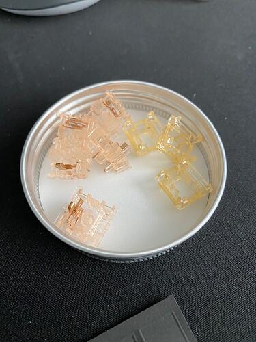
Random observation as I’m building these frankenswitches: though Gateron aren’t super forthcoming about housing materials for Inks, you can really see the difference that isn’t apparent when they’re assembled. The bottoms have a much more red hue to them then the tops, which are more yellow.
Fascinating. Kangaroos? I’m totally going to pop some open now…
Yup! You don’t really see it when it’s assembled. I honestly didn’t even notice it until today and they’ve been sitting on my desk for over a week now. I’m fairly sure the top is PC but that’s nothing more than a guess.
Ha, well son of a biscuit. They’ve been that way the whole time and I had no idea.
As many as I’ve taken apart you’d think I’d have noticed… perception’s a trip.
