Bolza Zakus
Another topping-off gone sideways here - but hey, I get to share some information with you:
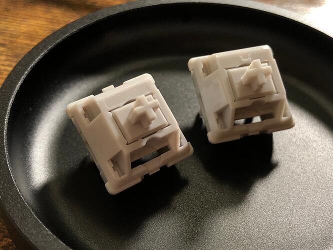
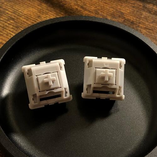
Original version ( A ) on the left, current version ( B ) on the right.
There’s a slight difference in color with the older version ( A ) being lighter, but the most obvious visual difference is the lack of branding on the top housing; no Bolsa logo badge on the first run.
The newer version I have here ( B ) has the Bolsa arch logo, which oddly enough is right-side-up when the switch is North-facing. This is consistent with many other Bolsa switches - as is the lack of a badge on early switches.
Why care? Well - I’m not pleased to report that the new switches ( B ) just aren’t as good. 
They’re fine switches in their own right - but noticeably inferior to the originals. They feel less substantial, less smooth, less stable - and the sound has a more “thin” quality.

