Certain, arguably minor, things about a layout will get under my skin until I run away screaming. I’ve realized one of those things about the main alpha(/numeric) part of a staggered keyboard: the inside vertical edges of the keys lining up from row to row (rather than being staggered from the rows above and below) just rubs me wrong.
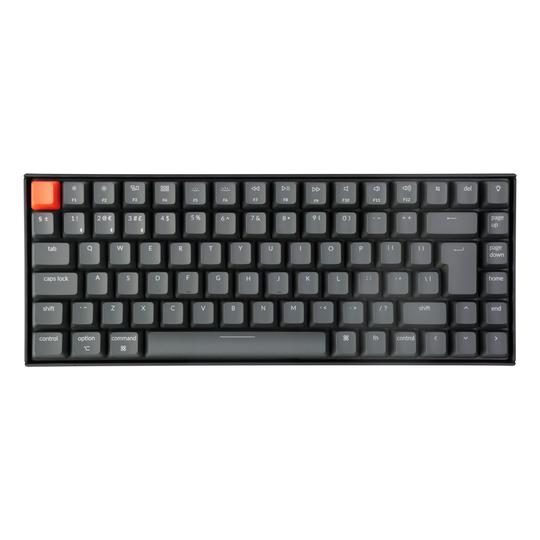
One particularly egregious offender is when the function keys are lined up above the number keys straight across, with no blockers. This just looks… hideous.
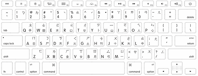
Another example is when an integer-u spacebar lines up with the bottom alpha row, like modern Apple spacebars which bracket C and M.
Another offender, the GK64 and its arrow cluster in the lower right.
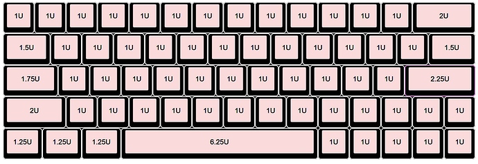
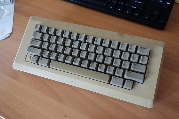
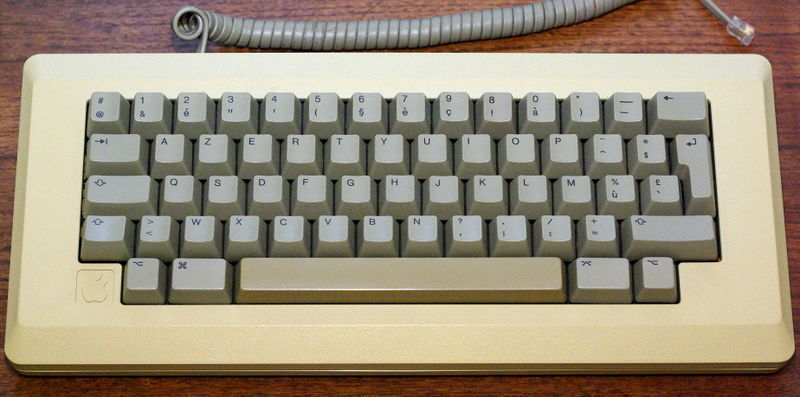
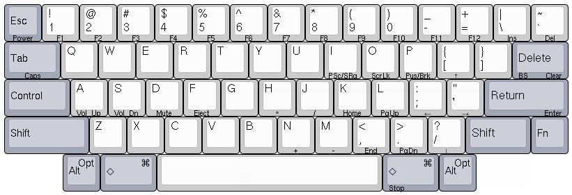
On the other hand, there are boards which never exhibit nearby rows having key sides intersect. A classic example is the M0110. In both the ANSI layout and the ISO (though with a regrettably and ridiculously thin enter key), the principle of — I’ll call it non-ortholinearity — is maintained. Also in this class is another widely-lauded layout, the HHKB (though not the Japanese variant).
Of course, on the numpad or navigation cluster, or on an ortholinear board, this is desirable and fine. My beef is not with them. Am I insane? This is kind of a big deal for me.
