During the stream a lot of people had opinions about the logo. Huey was saying how they wanted to find a new logo for the site. So among my more animus posts on the site I hoped to contribute some positivity!
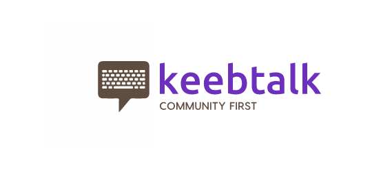
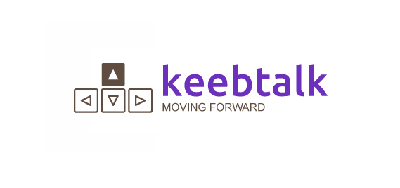
These are just some simple ideas i was throwing about. I’m happy with them as logo concepts.
The taglines are not intended to be taken too seriously. The 2nd one (“MF”) wouldnt be as relevant as the first in 8 months anyway.
Maybe tomorrow I’ll add one w/ a capital K.
What other ideas do you peeps have? Post your MSPAINT ideas here
It’d be better without the brownish color, maybe making it black or dark grey. it’d allow for an easier inversion for the dark mode too (if that’s a thing).
I’d say ditch the purple. It doesn’t fit the other colors used on the site (orange and blue — at least currently, with what I assume are default Discourse themes). Try it with the blue instead (#0F82AF).
Although, the current logo doesn’t look half bad on the dark theme. It grows on you the more you look at it.
The site doesnt actually have any of it’s own theme colors yet. everything seems to be default discourse so far. Also i’m trying to avoid colors other forums already use.
I also just picked random shit. i think it could use a better font for the main wordmark. but i like the icon a lot actually.
Nice work! I like both concepts, and think they have potential.
A couple of nitpicks:
Needs more favicon love. Let’s keep in mind that a future logo will have to work well at favicon size, too.
(The current logo does a fantastic job at that. This is the reason #1 why I still prefer the current logo over the proposed ones in their current form.)
That Arial typeface in the second tagline needs to go.
Content of the tagline: Despite your disclaimer, I hope we’ll come up with a wording that’s a better fit for the spirit of this community.
Hey, thanks for this! I actually really like both of these. Gonna ping @Manofinterests so he can see, too. I think I personally like the first one even more. Great work!