Hi, everyone. I’ll show a new design of 65% keyboards:SPACE65 ;D.
Here is a short IC form of SPACE65,Thank you for your reply: Graystudio SPACE65 IC
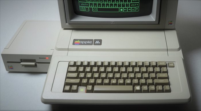
Space65 is inspired by two great feats of my mind in 1977: Apple II Computer and Voyager 1.
Apple II:
Voyager1: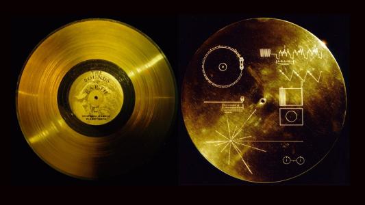
In appearance, I want to design an ancient and modern keyboard.At the same time, it must be very distinctive.
Now I have completed the design, and below are some details of my design.
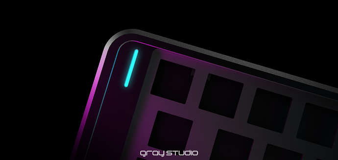
On the top side of space65, I followed the wide sides and the concave design of Apple II`s keyboard (Details on the left and right sides).
Render:
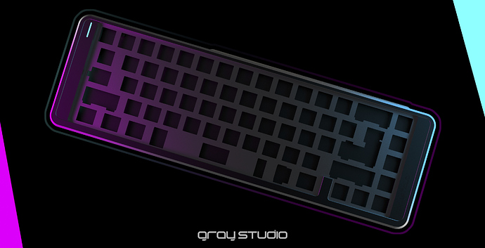
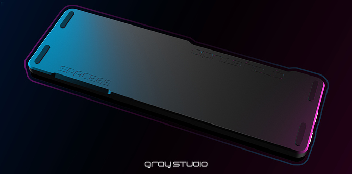
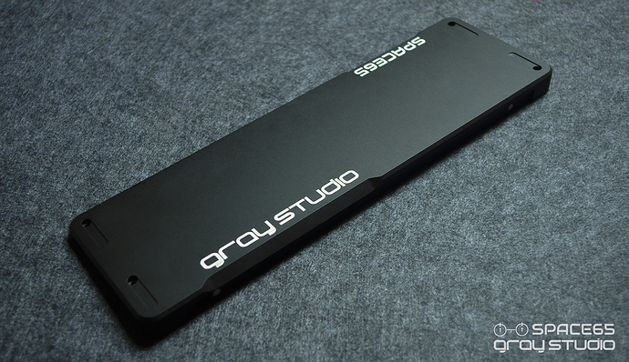
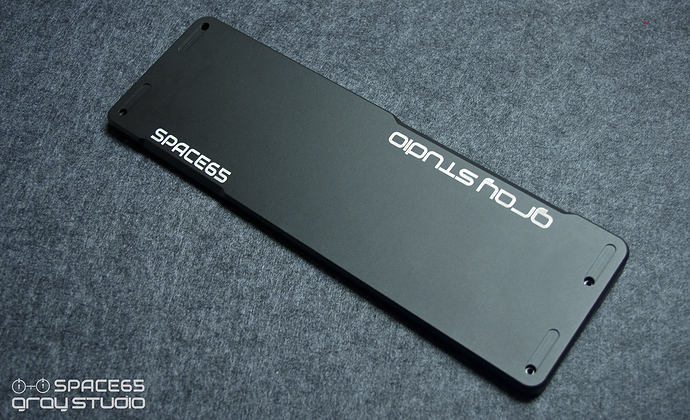
On the bottom, I want to design as concise and smooth as possible and have characteristics.So I made an asymmetrical design on both sides.
Render:
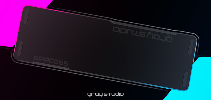
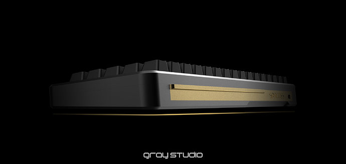
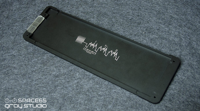
On the back, I designed a nameplate that almost runs through the whole keyboard. And there is a convenient wing to pick up it.
Render:
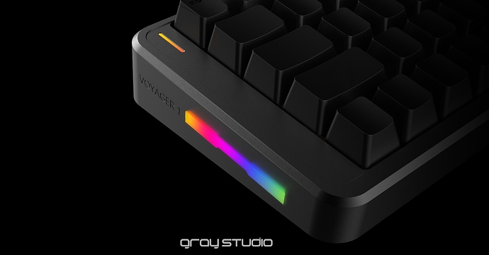
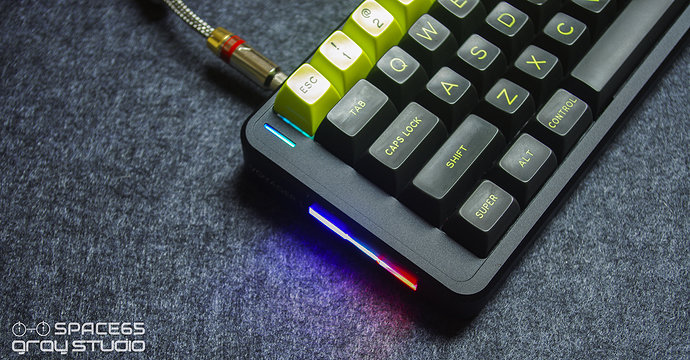
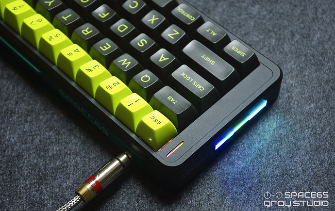
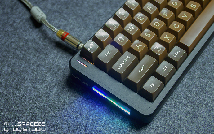
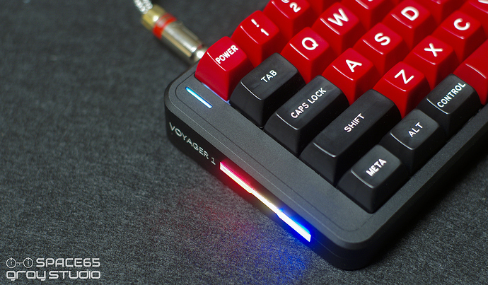
And a RGB LED light strip on the left side(Made of acrylic by CNC).
Render:
I am a little worried the overall effect is not perfect, so I quickly completed the proofing to test the effect of SPACE 65(Especially the effect of RGB).
But after receiving the sample, I found a very obvious mistake.
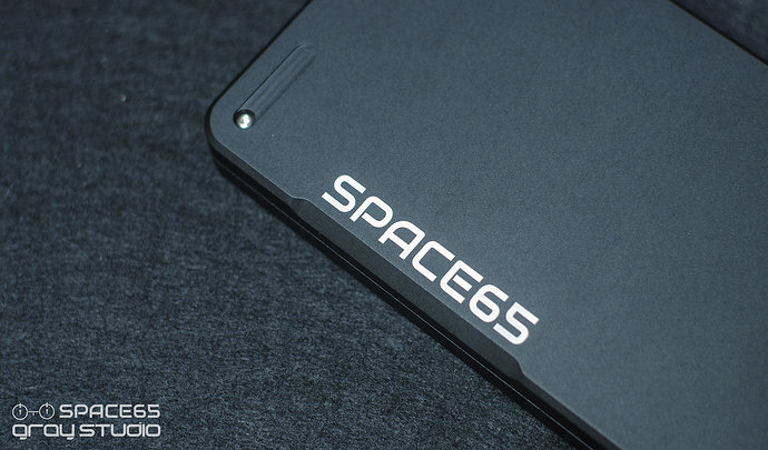
Its about logo,I want is the concave effect by laser(reference render).
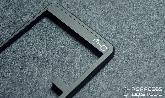
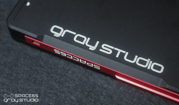
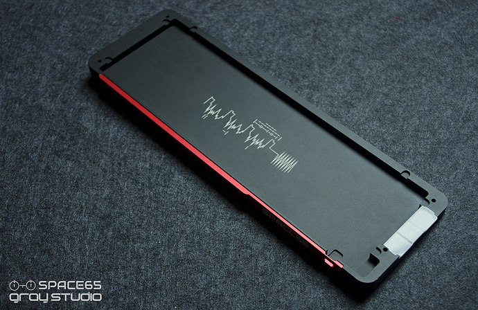
Then I got the keyboard,I found its the white mark of laser carving.
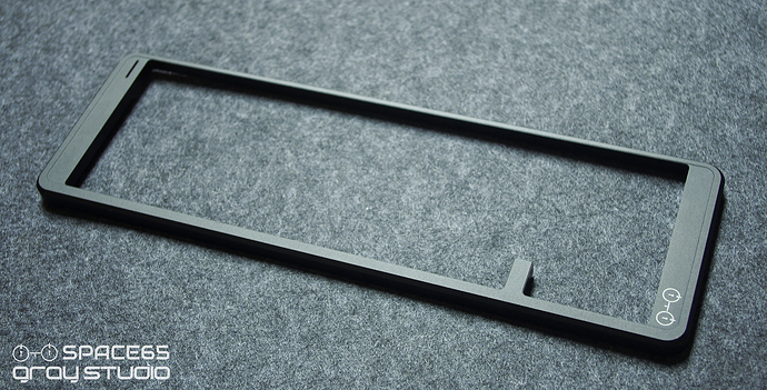
TOP CASE:
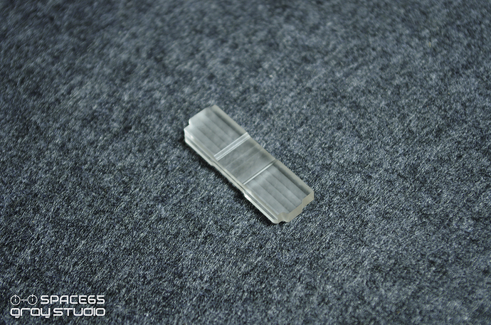
LIGHT STRIP:
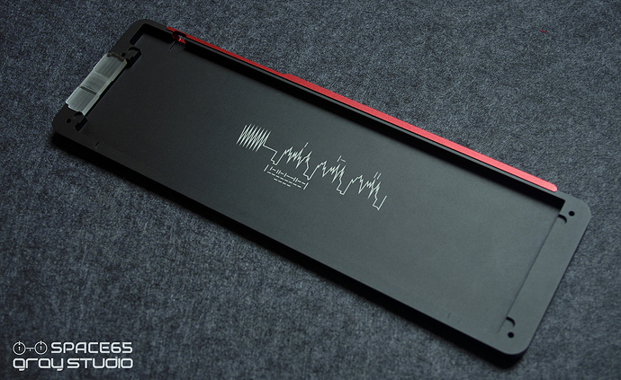
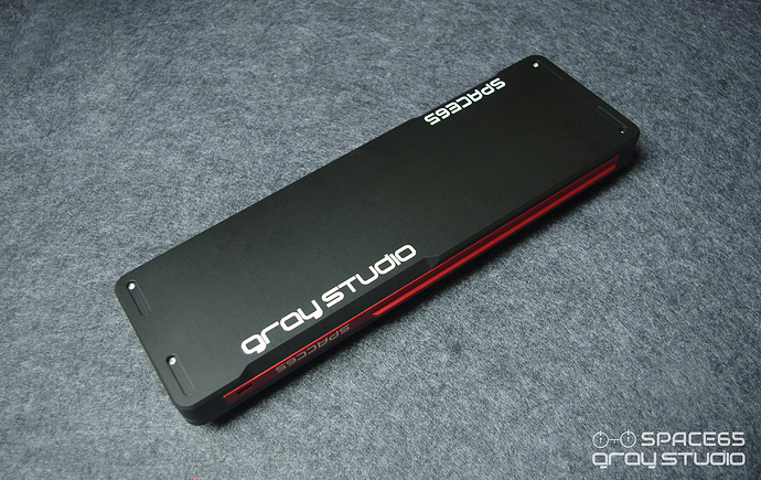
BOTTOM CASE:
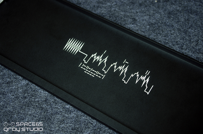
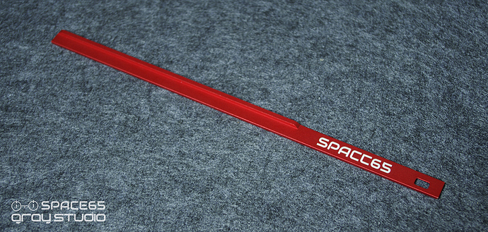
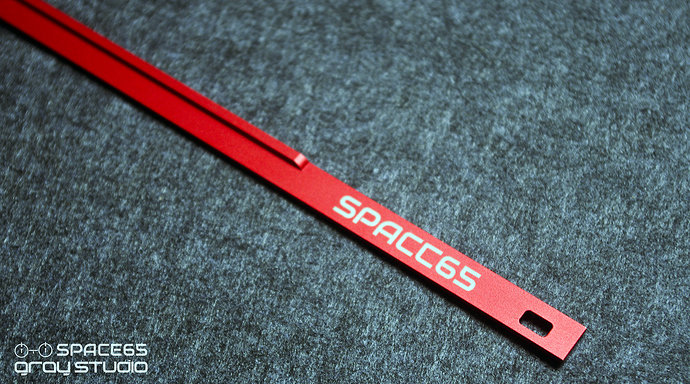
NAMEPLATE:
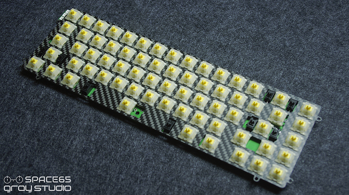
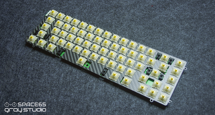
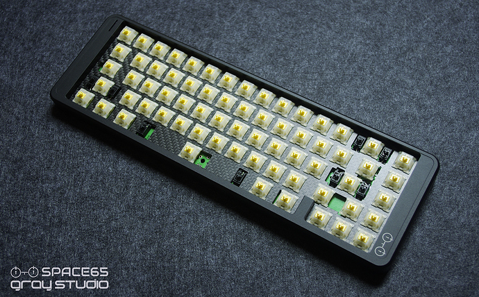
CARBON PLATE:
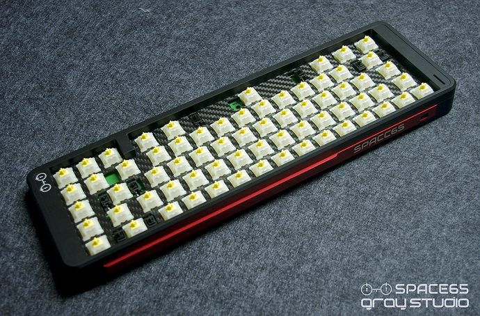
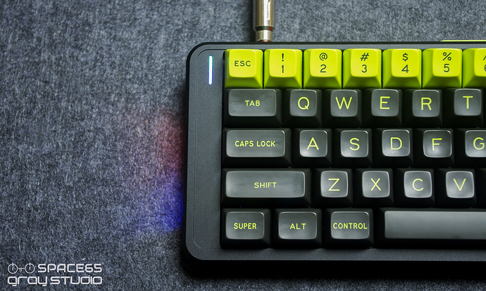
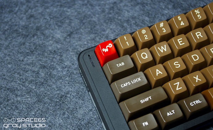
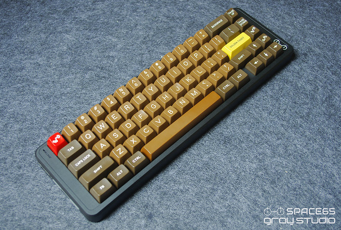
The effect of switchs:
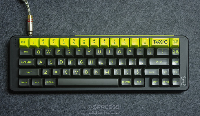
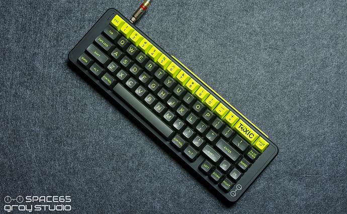
With SA caps:
However, the overall effect seemed to be good enough…
So,now it deeply troubled me, I am struggling which looks better(about the white mark of laser carving or Depth of carving).
In a few days, I will proofread again,then compare the two effects.
Other details:
Case material:Anodized Aluminum 6061
Plate:Carbon fibre.
Angle:5 degrees
PCB:Bootmapper;two RGB LED light bars;Switch LED Position:South
Colors: Black , Silver, Gray, Blue, Red(Up to now)
What do you suggest for SPACE65? So hope you could provide it to me, and then we can better finish the design of SPACE 65.
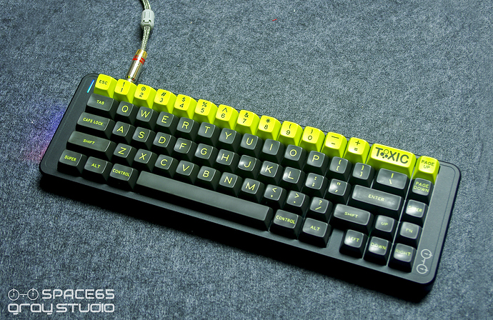
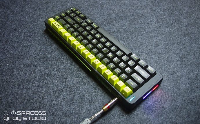
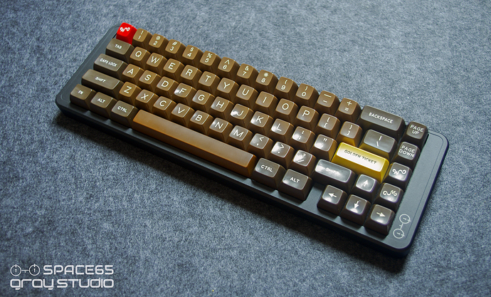
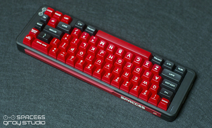
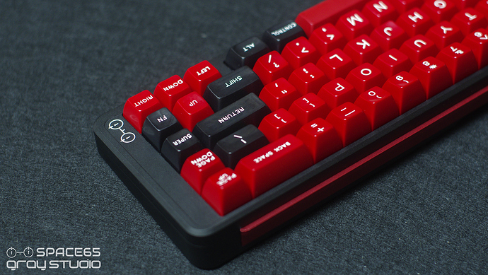
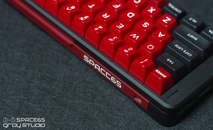
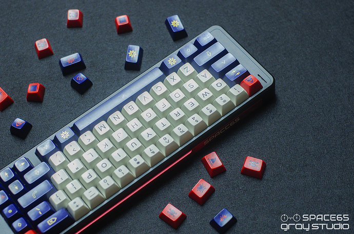
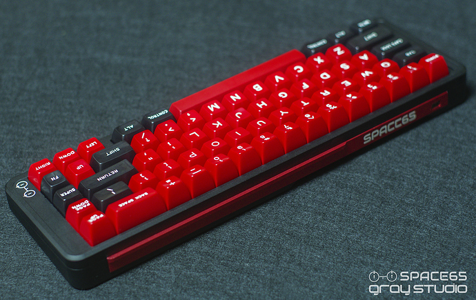
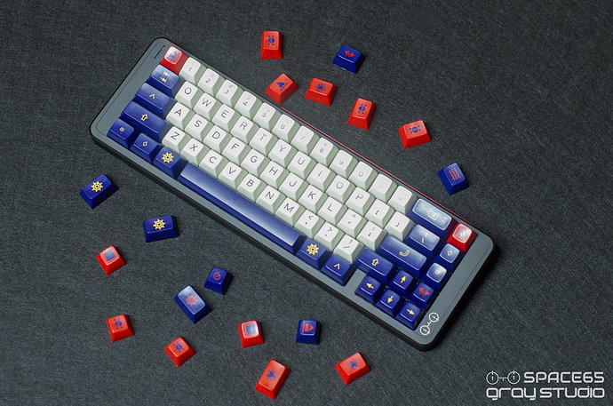
Effect of with keycaps.
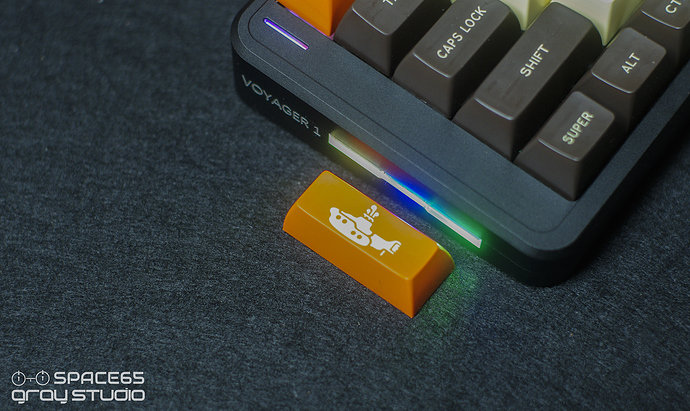
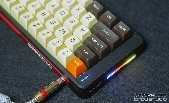
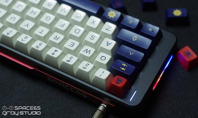


 Lots of different parts on this one.