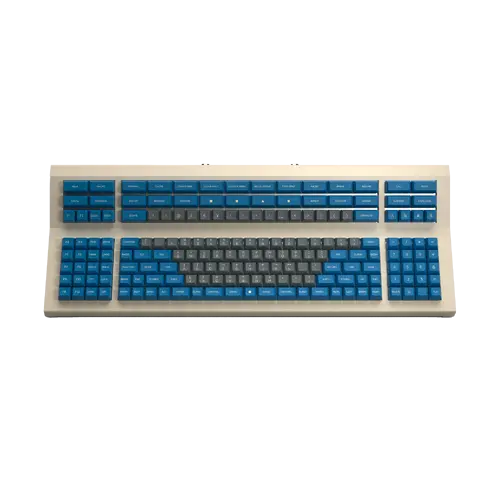
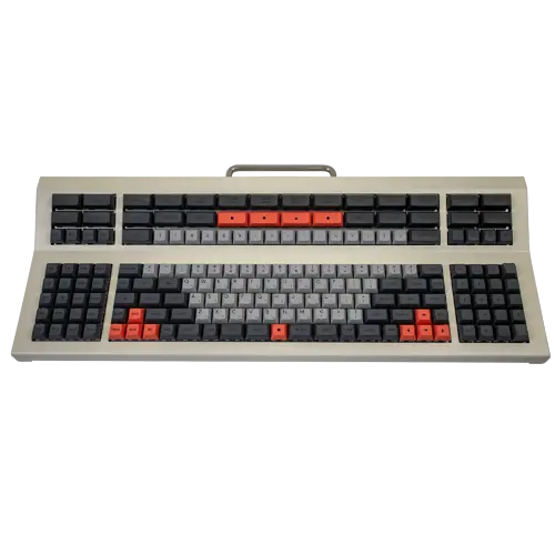
Bringing balance to the board

This is something that’s been bugging me on a subconscious level for some time, and I’ve only recently recognized what it is and given it a voice. To quote Morpheus in the Matrix:

“What you know you can’t explain, but you feel it. You’ve felt it your entire life, that there’s something wrong with the world. You don’t know what it is, but it’s there, like a splinter in your mind, driving you mad.”

When you’ve been stuck in the full-size keyboard matrix for long enough, you don’t know that there are other layouts, other possibilites. Eventually, when you’ve tried enough of those, you realize there’s a certain ineffable grail, a search for perfection. Taken to the extreme, this search for perfection is called by those in our hobby “endgame”. This pursuit may be a fool’s quest, and it is without a doubt different for everybody, but along the way we can learn some valuable lessons about the tools we use and our preferences and needs.

I’ll get to the point. Or rather, the center.

After having tried quite a few different layouts, I’ve come to realize that the ones I like the best position the hands on the home row in the center of the board, without too much of the board offset to the left or the right. Why, besides aesthetics? Ergonomics.

It feels like, along with the drive to minimize hand movement by putting less-used keys on layers, a common goal is to minimize the board’s overall size. Whether going from 100% down to 75 or 60 or 40%, the progression serves the same goal: freeing up desk space and allowing easier access to the mouse or pointing device.

When you consider the case of a full-size keyboard and right-handed user, the typical office and home use case, it is far from optimal due to the amount of hand movement to go from the home row to the mouse.

Look at that. It’s ABSURD.

Ideally the hands would be centered on the board in easy reach of the most used keys, and with minimal travel to the pointing device.

For me personally, I value form as much as function. Lately my quest has been for layouts where the home row keys are, quite literally, dead center. This is quite aesthetically pleasing.

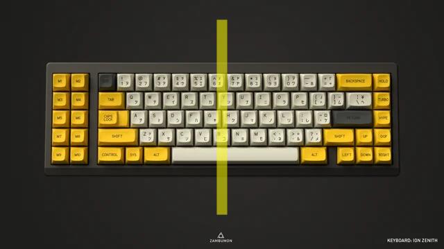
One example of this is the 65XT layout. One super pretty example of this layout is the Zenith.
image

Note that the center of the board coincides with the center of the home row keys, between G and H.

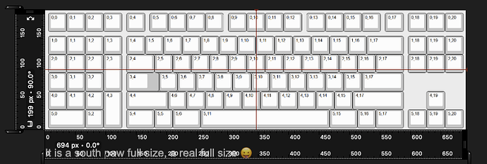
This is not the only example. Our very own @Rico’s new Aquanaut is a southpaw layout that exhibits this characteristic (only missing the mark by 0.25u, but I’ll allow it).

Does this resonate for anybody else? Are there any other centrist layouts that you know of?

(I know this is a long wall of text, but I think we can all use more balance in our lives, and in our layouts.)

7 Likes

Funny you said that because this is THE reason why I designed the Aquanaut.

I also found something weird using boards like standard full size, 1800 and TKL layouts.
My brain wants a symmetry happening on the desk, that is have my keyboard dead center with my screen.
But if I do that my arms are not ideally positioned to the center of the alpha area.
As a result I constantly (and unconsciously) moving my keyboard left and right to be either centered to the desk or have alphas centered to my arms.
This does not happen to me with low dissymetry layouts like 75%.

Another thing is keyboard design related were you have to select if your USB cable must be at the center of the keyboard (usually with a USB daughterboard) or asymetrically placed.

For example on a TKL it is not uncommon to have the USB cable go out between the alpha and the nav clusters, and I find it a little bit less weird doing this than having it centered on the board. The TKL layout is a heavy asymetrical layout so it is not shocking to me that the USB cable is positioned in an asymetrical fashion.

It is unlikely that I will offer Aquanaut boards to people in the community (unless someone is brave enough to invest and deal with a potentially flawed early prototype), but there is a very young and talented designer that is doing just the same layout (with the possibility to switch to a standard 104 layout).
This man is called Bowl, he is very productive and known to deliver smoothly.
The project is in groupbuy stage and is called the Pangea Full Size, the board is simply gorgeous !
Here is the link if you folks are interested:

4 Likes

I never actually built one, but I was noodling around with a symmetrical AT’ish 59-key layout before I settled on a “safer” TKL-like.

3 Likes

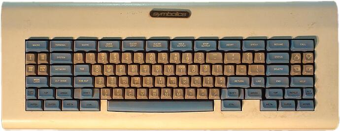
Symbolics Lisp Machine (Space Cadet) gets honorable mention. It’s about 1.25u off though.

6 Likes

A couple of layouts I’ve been noodling on have the centrist philosophy.

77XT

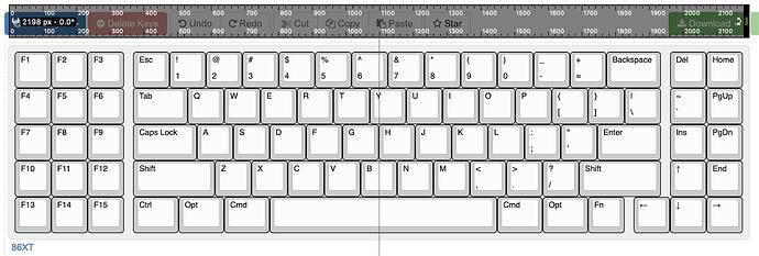
86XT

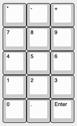
The macropad can also work as a (mostly functional) numpad, if you like. I never really use the math keys so I’d be strongly tempted to replace the top three keys with rotary encoders. Knobs > math.

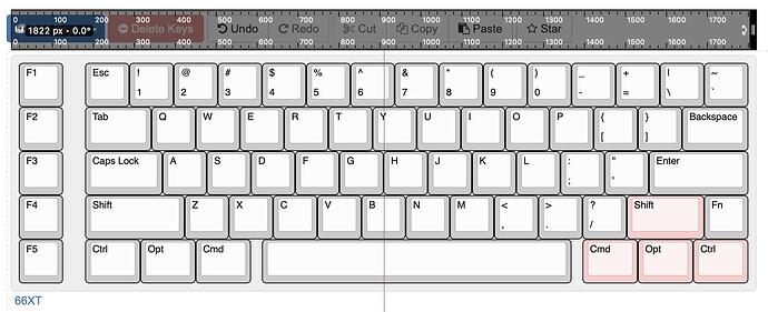
66XT


Strikingly similar to @wjrii’s layout above. The right-hand mods double as arrow keys.

2 Likes

The Hyper7 tribute board is even more symmetrical:

5 Likes

You win :smiley:

3 Likes

omg, did you see the new one unboxed on Chyrosran’s channel? It’s gorgeous. I hate that they went with Chinese XDA keycaps, but damn, they look good. Whole thing looks amazing. I’ve never wanted a huge keyboard, but this gives me the feels.

8 Likes

I think XDA is underrated, a victim of its own simplicity, but yeah, this thing is screaming for R3 SA, KAM, or they could have got some marketing synergy by getting a PBS set made.

And yes, nice new case and color scheme. Like a Saturn60, but more of a Saturn173. :slight_smile:

3 Likes

Can’t wait for the review proper! Tom likes big boards and he cannot lie.

2 Likes