Durock POMs also has this resistance feeling, though I feel with them it’s the result of using a soft plastic rather than tight tolerance with thick lubricant.
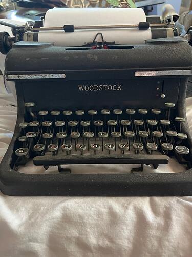
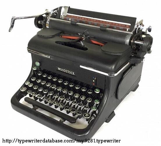
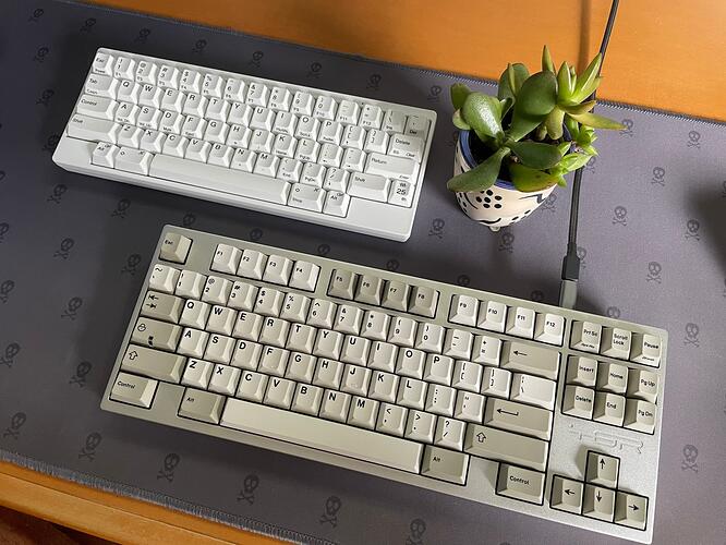
Looks pretty similar to this 1942 Woodstock 5N typewriter:
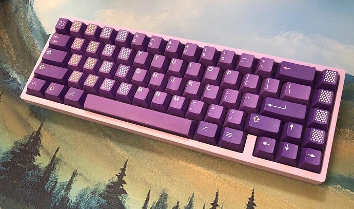
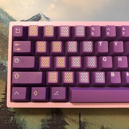
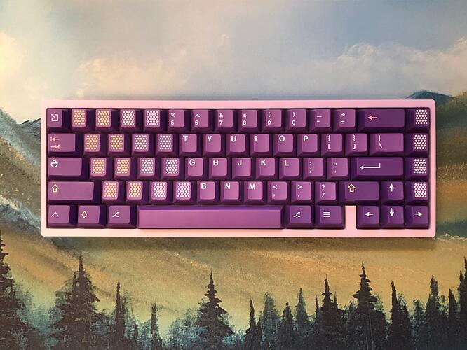
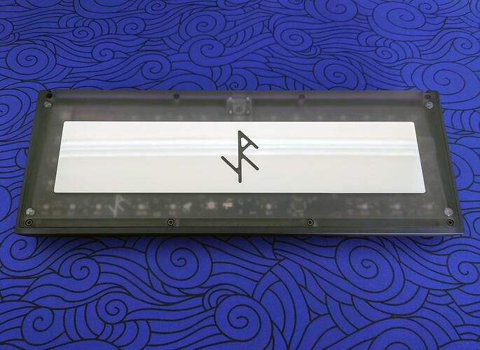
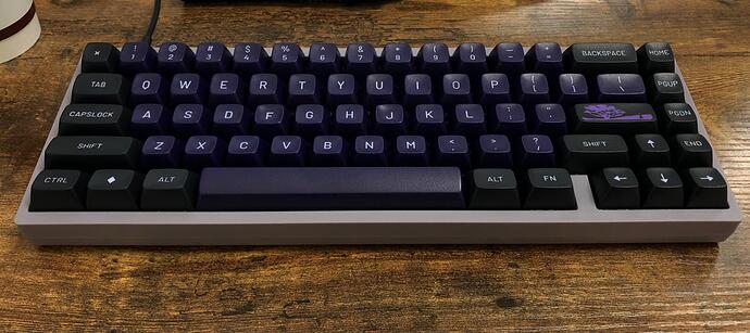
I finished the build on my workbench:
This thing has a vibe somewhere between Future Funk (the genre, but also the keyset), Synthwave, and Magic Girls (the trope, but also the keyset).
I love it.
The lighting in here skews warm;
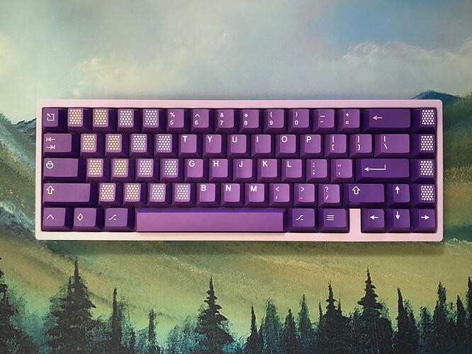
Here’s a vague attempt at compensating for that with my phone:
Still looks kinda warm, but you get the idea. It’s pretty.
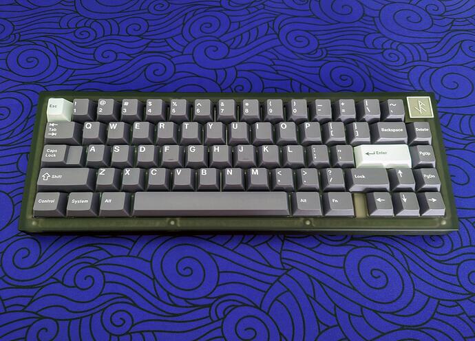
The parts:
- KBD67 MKII V3 soldered PCB
- KBD67 Lite Lavender case
- Smaller bumpons in lieu of included ones
- Polycarb plate from R1, standoffs omitted
- TX stabs in white with a 205/206 mix
- Gazzew Boba LT long-pole linears
- GMK Serenity
The Lavender case is a bit lighter than I expected, but I think it looks fantastic with this set. I’d originally decided to go for this case to pair with Serenity, and I don’t think I could be happier with how it looks. More thoughts on the build once I’ve had some time with it.
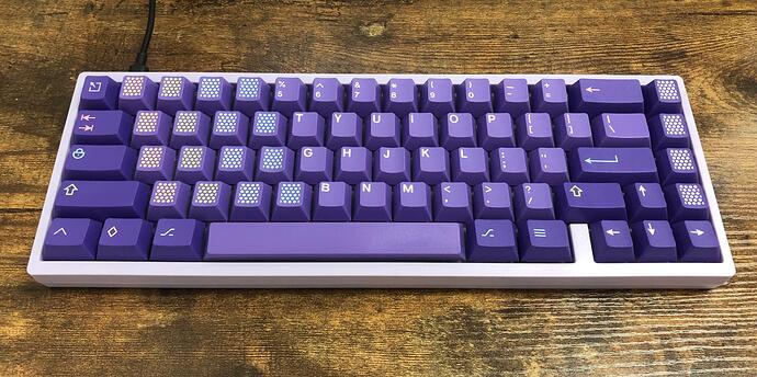
Edit; the lighting at work is a lot more color-neutral:
This photo is actually a touch on the cool side; the faint lavender color is a little more noticeable IRL. Purples are notoriously difficult to photograph accurately, especially if there are other colors in the frame.
Here’s a quick recording:
Dude, this is so great. Your attention to detail is most appreciated.
That’s an incredibly helpful description.
Giving XVX profile a try this evening.
I think these are a PBT blend. The profile is somewhere between CXA and MDA. Quick comparison to CXA here.
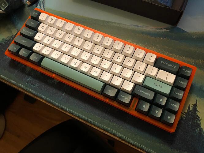
Well, I think these look really nice! Surprisingly decent qua-


Facetiousness aside, these seem like remarkably decent caps for the price. Infernal homing-nips notwithstanding.
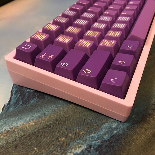
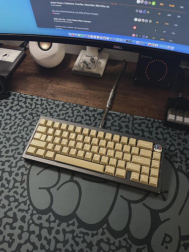
You might notice, though, that there’s a control key where the right shift should be, and a menu key where FN might be. That’s because this particular set came with two left shifts and three WIN keys.
But hey! It was cheap and looks pretty nice with this case, on this deskmat. The caps are pretty thicc and don’t feel or sound too bad at all:
KBD67L
- FR4 plate
- JWICK Semi-silent linears
- XVX profile PBT blend double-shot caps
- Owlstabs
- PCB foam
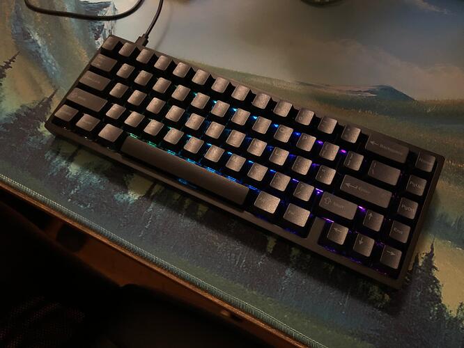
What it looked and sounded like earlier today:
KBD67L
- POM plate
- JWICK Semi-silent linears
- Cherry profile PBT dye-sub caps
- Owlstabs
- PCB foam
Same switches, PCB, stabs, case type, and foam setup - different plate and caps.
So sexy.
Looks amazing. I really wanted to get that set, but it doesn’t have any runs now, so I went for SCII. They seem so similar in color. Masterpiece legends are nicer though.
- Parallel Sequence
- Black Inks
- POM plate
- 30A o-ring
- GMK Sandstorm
Hard to accurately depict the tones of Sandstorm through an iPhone. Fav set forsure!

Cue Gnarls Barkley’s Transform
Same PCB, stabs, and foam as the last two;
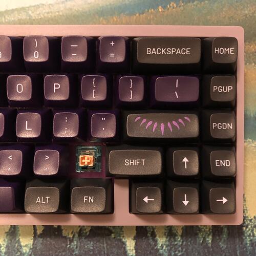
- R4 purplish-grey case
- new purp PC plate
- Skyloong Glacier Rose tactiles
- MT3 Black Panther
I didn’t plan it this way but dang, that case and those keys - I think they’re staying together.
Can you switch easily between spilt and full backspace?
Polycarb Iron165 Smoke / Stainless Steel. R1 White POM plate, SP Star Polaris Grey switches, spring swapped to 57g TX springs. GMK Alpine.
Haha yea! Ever since getting use to HHKB, I now program most of my non-HHKB boards to have the pipe set to backspace, caps lock is control. So a bit like cheating but it works for me.
Took this one to work today; much more color-accurate lighting here. The faint purple of the case and legends almost reads as silver; I love the way these look together. Haven’t decided if I prefer the splash of brighter color with the novelty key or not; realized the other one I was using was the wrong row.  I think it’s a nice accent and compliments the much warmer purple of the plate - but I also kind of like the more muted look without it. When decisions like these are the hardest I have to make, it’s a great day.
I’m trying the Skyloong Glacier Rose / Epomaker Silent Iceberg Rose tactiles in this keeb, and I’m liking them so far. Not quite as satisfying to me as TTC’s Silent Bluish White, but a strong contender in the space, I’d say. These Rose versions have a pretty strong, big bump - not too different from that of the Bluish White.
The pliant-leg dampeners don’t have the same effect that silicone rubber ones do, but it’s remarkably similar, considering. The bottom-out is as soft and quiet as you’d expect from any dampened switch. The top-out is somewhere in-between a standard switch and a traditionally dampened one; I’d say it’s significantly more quiet than a typical polycarb housing top-out, but more loud and sharp than the top-out of most dampened switches.
Here’s a quick and dirty recording from my desk at work:
It’s less the volume and more the sharpness of the sound. There are also pliant-leg dampeners on the top of the stems and they do succeed in reducing the volume and harshness of the sound and feel, but there is still a faint but sharp report on top-out; a light tick sound. My guess is that the spring isn’t able to keep the stem from bouncing (on a very, very small scale) when it tops-out, and that’s allowing that little leg to release its impact vibrations out into the air instead of absorbing them into the housing and spring.
I’ll be able to say for sure one way or another in my full review, but I have a hunch that just a tiny dab of lube in the right spot(s) will eliminate the light ticking and make these already quiet switches all the more so.
