My daily driver QuietKey with Zorro Blue + new PCB module with Mute Jade I’m building.
9 Likes
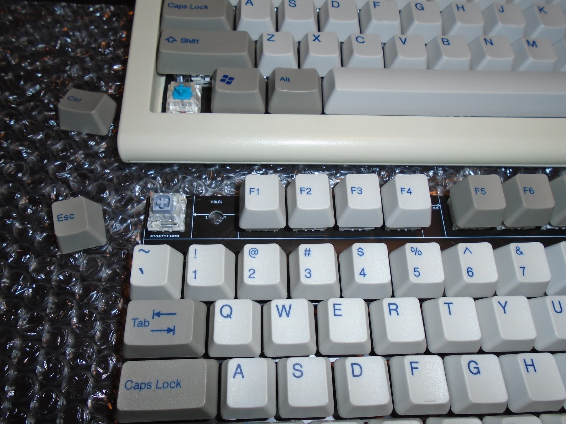
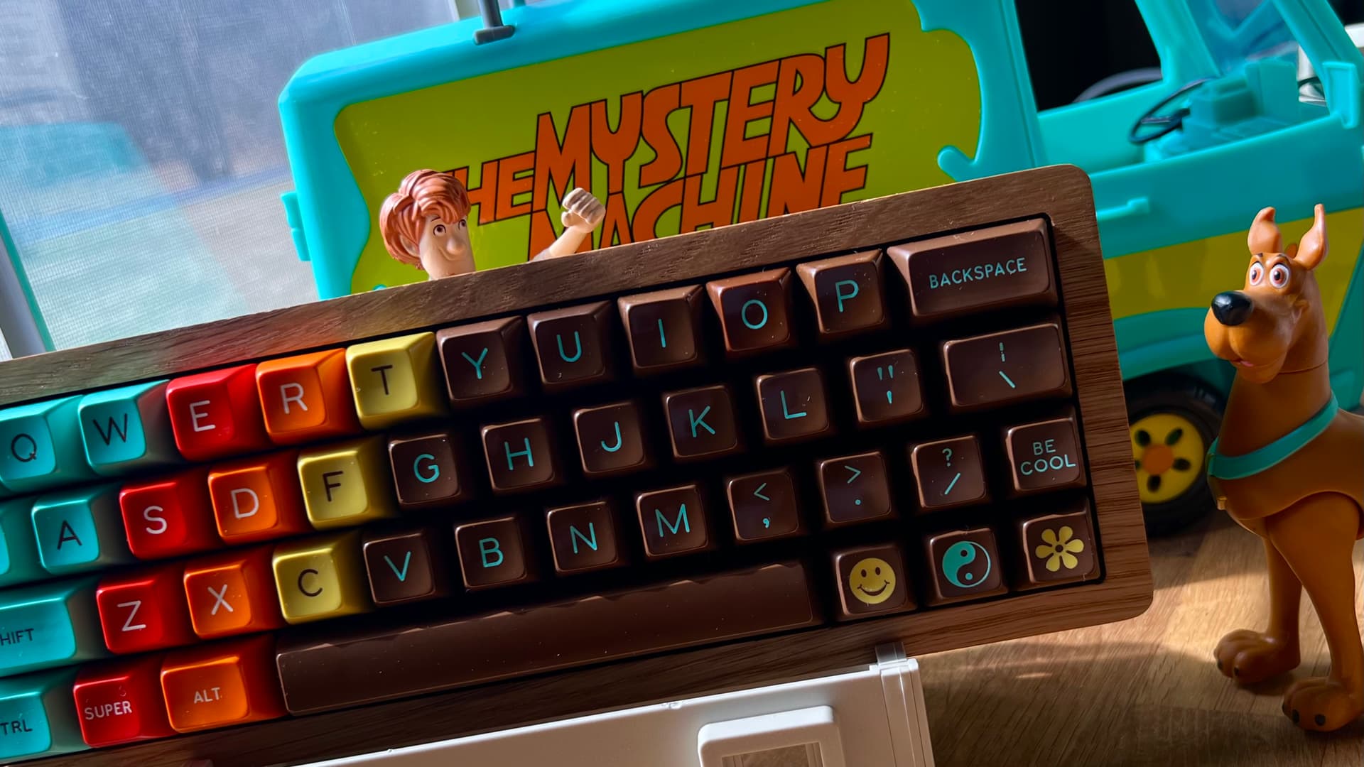
My work keyboard started acting funky, so I put this one together - Tokyo60 Slate with MT3 Dusk. Really love how the color on Dusk pops. Gives me serious Solarized Dark vibes.
13 Likes
That looks pretty good, a lot better than i would have expected it to look. How does the tokyo 60 feel/sound?
2 Likes
Your PCB looks also super clean 
1 Like
It feels really good to me- I have halo tactiles on it. That with MT3 makes it have a really solid feel to it when typing. It’s a quality board that’s getting a bit long in the tooth as a friend likes to remind me- it doesn’t have a lot of modern features. But for the price point, I’ll take it.
Nice, is that double shot from ePbt ? Happy with it ?

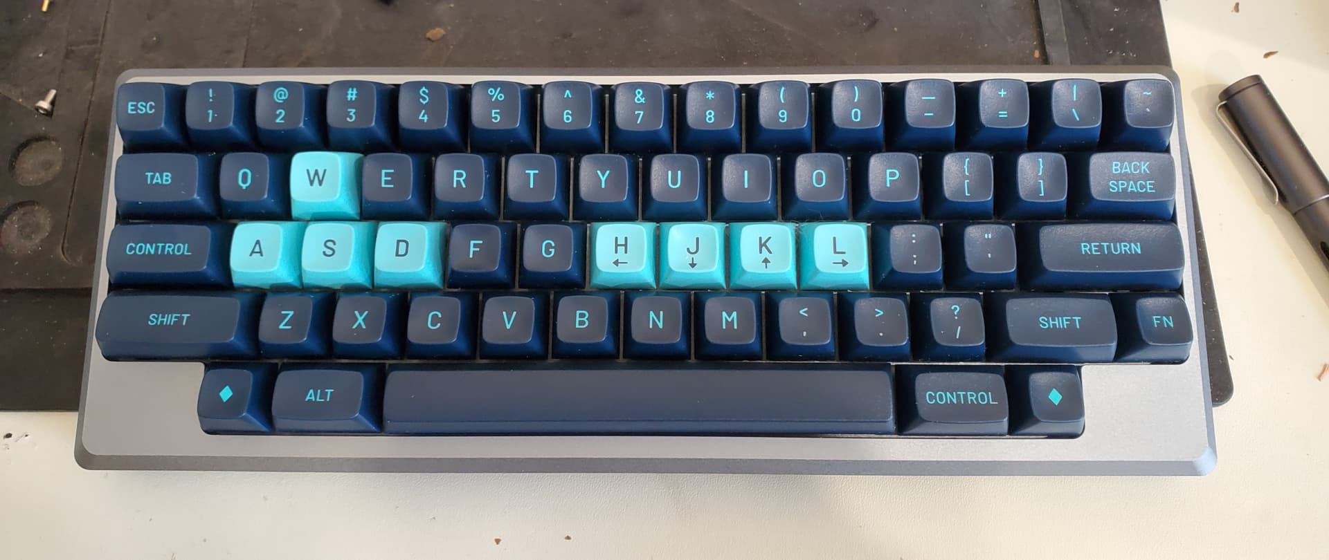
this is on my desk today! love this board.
9 Likes
Thank you! Yes it is, I’m actually pretty happy with it. It’s not quite GMK but it’s still really nice.
1 Like

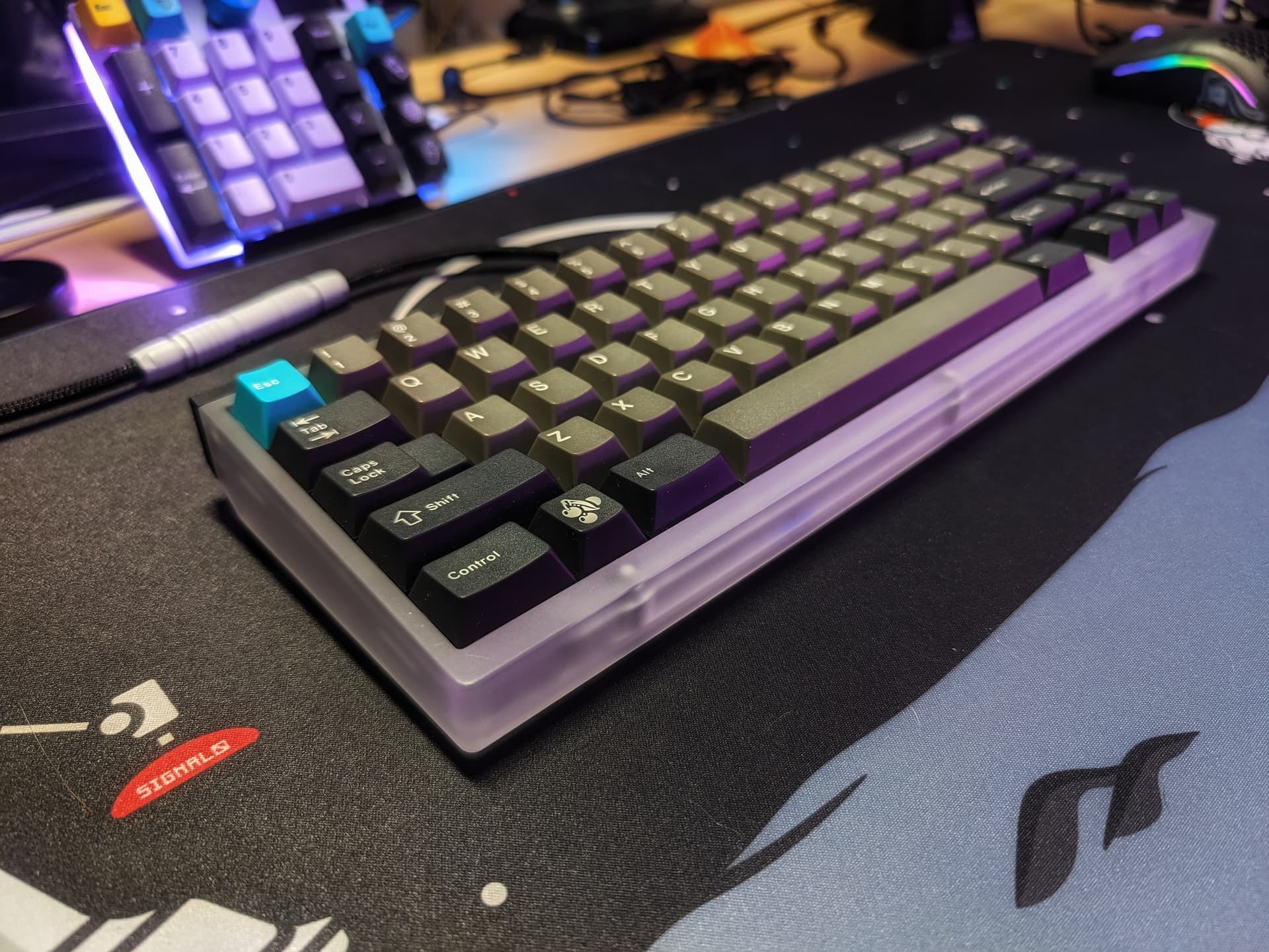
Keycaps: Milkyway PBT-02 (Blind box defect set from CNY sale).
Deskmat: Midnight Cravings by Input Universe
I was actually having trouble with this picture because I couldn’t turn off my phone’s overzealous sharpening and had no control over my lighting angles. I really wanted to go for the full black keyboard effect to make it melt into the deskmat, but it just wasn’t happening so I ended up settling with this. Not the best color-combo (I like to try) on its own, but I think the deskmat manages to make the whole thing work out…kinda?
Me…being me. I decided to use semi-complicated means to fix it (me no photograph very often). I ended up training an AI image upscaling model (with help from PHD friend very familiar with tech. Short ver. we used ESRGAN and cupscale, and lots of training images) to deal specifically with the terrible, terrible reflections in the original image (obscured the whole left half of the keycaps).
It…turned out better than I expected. The AI guesstimated from pretty much garbage levels of pixel information, and actually made semi-legible (but melty looking up close) approximations of the type face. It’s not perfect, but whew. You can actually still see some of the remnants of the reflection it tried to clear up, but the reflections look like a more natural product of lighting rather than something an AI cleaned up. It’s also got a bit of wavy grain from trying to fix the graininess from the sharpening, but all-in-all…I can see myself training and using models for even more specific upscaling needs.
Edit: Am sad that the website automatically downscales the image. Upscaled file was actually like 121MB.
6 Likes
Lmao, that might be the most complicated photo editing process I’ve ever heard of. It looks great!
p.s. I’m pretty sure downscaling was turned on a while back because the cost of running the website was getting very inflated due to all our bandwidth usage.
2 Likes
Thanks for the info! I’ll probably downscale the image myself before posting them here.
The whole process is honestly very CSI Miami zoom meme levels of mindblowing. The modesl trained for hyperspecific use cases can be pretty insane. Though the general use models do very well…especially when upscaling purely 2d or 3d images. They falter a bit when you introduce 2d and 3d elements overlaid together.
Thanks for your reply 
1 Like
Great shot!
1 Like
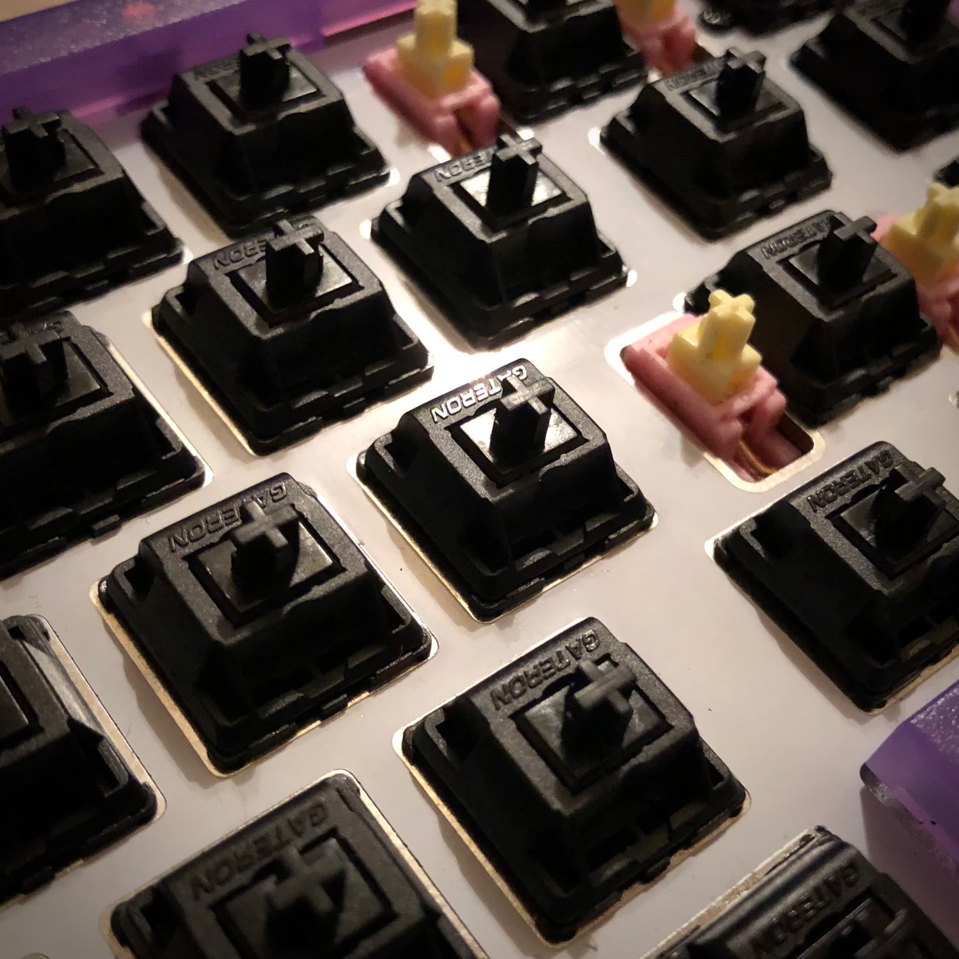
Giving Oil Kings a try this evening. Two impressions off the bat:
-
Very smooth and clean for a stock switch

-
Much more high-pitched and “thin” sounding than I was expecting

Not a bad sound by any means; just not what I was expecting. While the pitch is high, I wouldn’t call it harsh - and it is remarkably clean. I might like the timbre of Vermilion Birds more - but all other things being equal, the Oil Kings’ sound is more refined for its lack of spring chatter. (Chatter I could only hear with big tall caps on, but still there.)
This is only a first impression, but so far these Oil Kings are sitting on the very small shelf of switches I don’t feel any need to tune - which is indeed a category I value highly. I was convinced Vermilion Birds were in that category until I put MT3 caps on them and heard their springs talking. Not so with the Kings.
6 Likes
I guess that makes sense. They’re not “greased” but “oiled” which doesn’t usually do much to lower the pitch from stock sound. I’m hoping to get mine on Monday. I was planning to use them stock in a soldered build. We shall see…
From my testing, the “thin” sound is due to the top. Next to an Ink, the bottom out sound is similar, but the top out is not. I bought some to source cheaper and refined Inks (CJ improvements with an Ink bottom housing), and I bet once the top housing is lubed to my liking they will be an Ink with more character. I know they are advertised as being lubed enough to use stock, but I haven’t found a prelubed switch yet that fits the bill (no one lubes the top housing for instance – a must for me).
On a side note, the advertised spring weight seems way off. In fact when doing the stem to stem press test against other switches, they seem identical to the springs in the Gateron X’s (yellow). Every switch that was 67g bottomed out the Oil’s before they fully depressed. This includes the “60g” CJ switches (which weighting is also BS as they are easily 65 - 67g springs and depress Gat Yellows in this test). Gateron is doing something weird with the reported weights with their new switches. I would love to see some testing with real equipment to know for sure.
4 Likes
