Sometimes I like to play a game where I try to figure out the themes behind Chinese keycaps. Both of these efforts are good, but have me scratching my head.
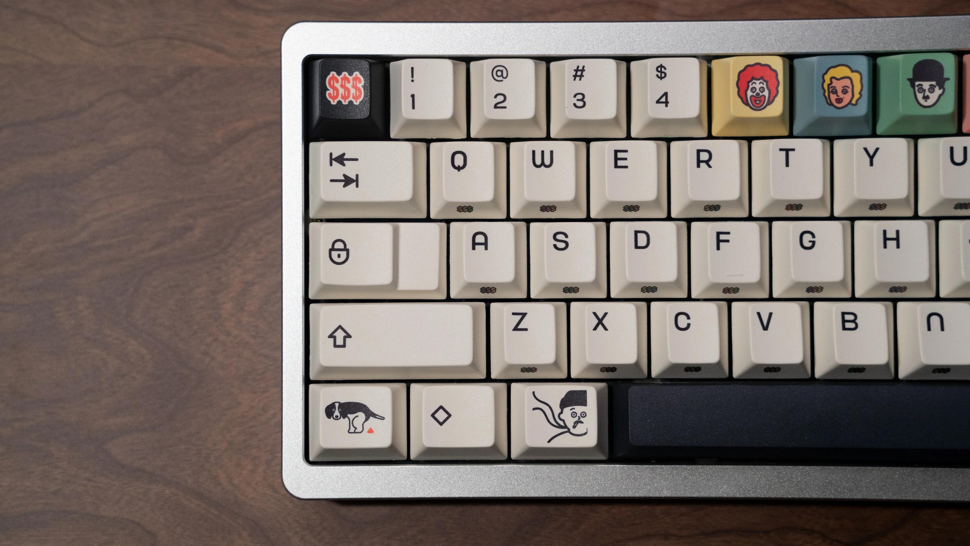
First up we have a set based on 1950s pop-art and trading cards. We get Charlie Chaplin, Marilyn Monroe, Ronald McDonald, Cigarettes, etc.
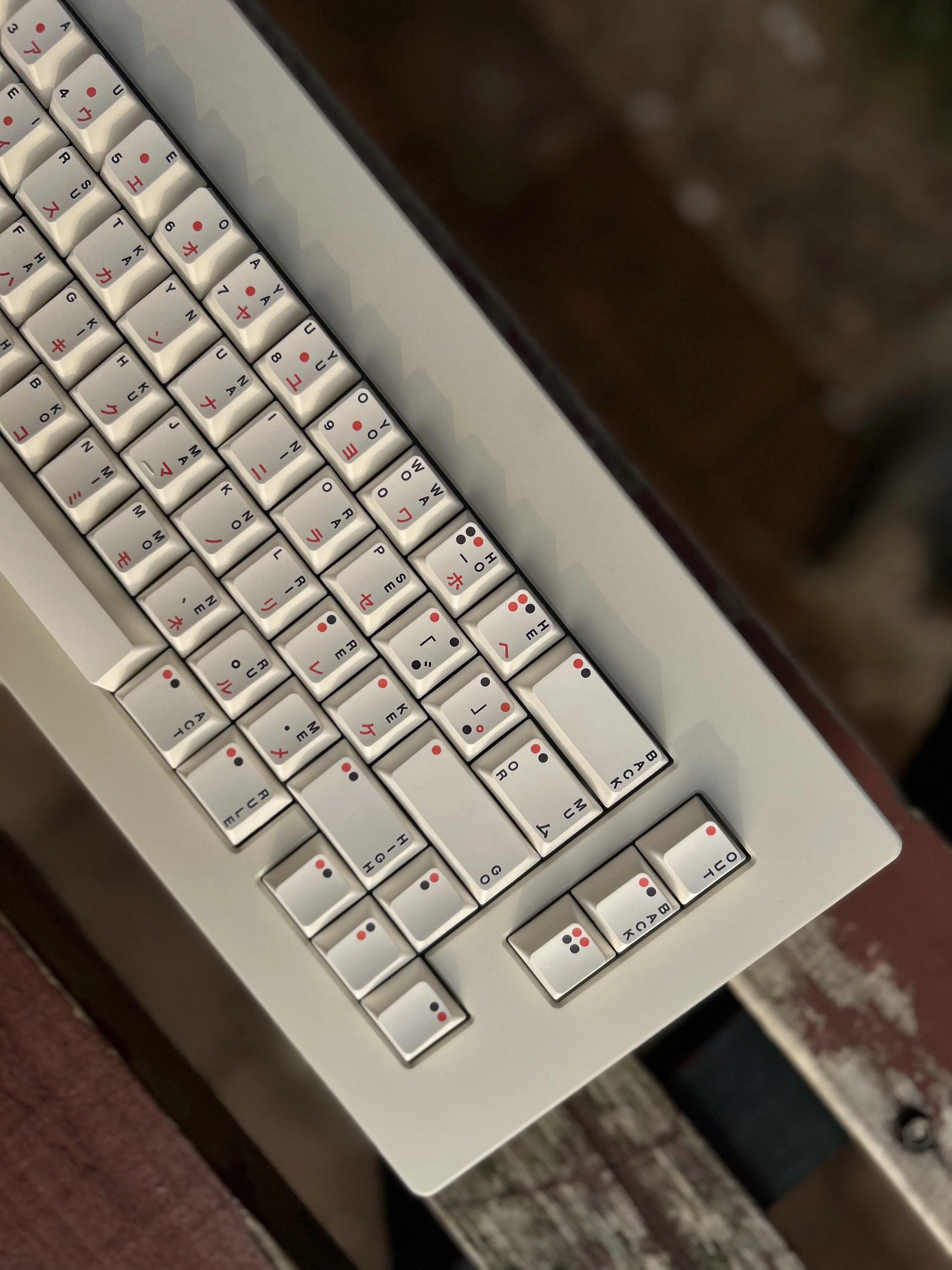
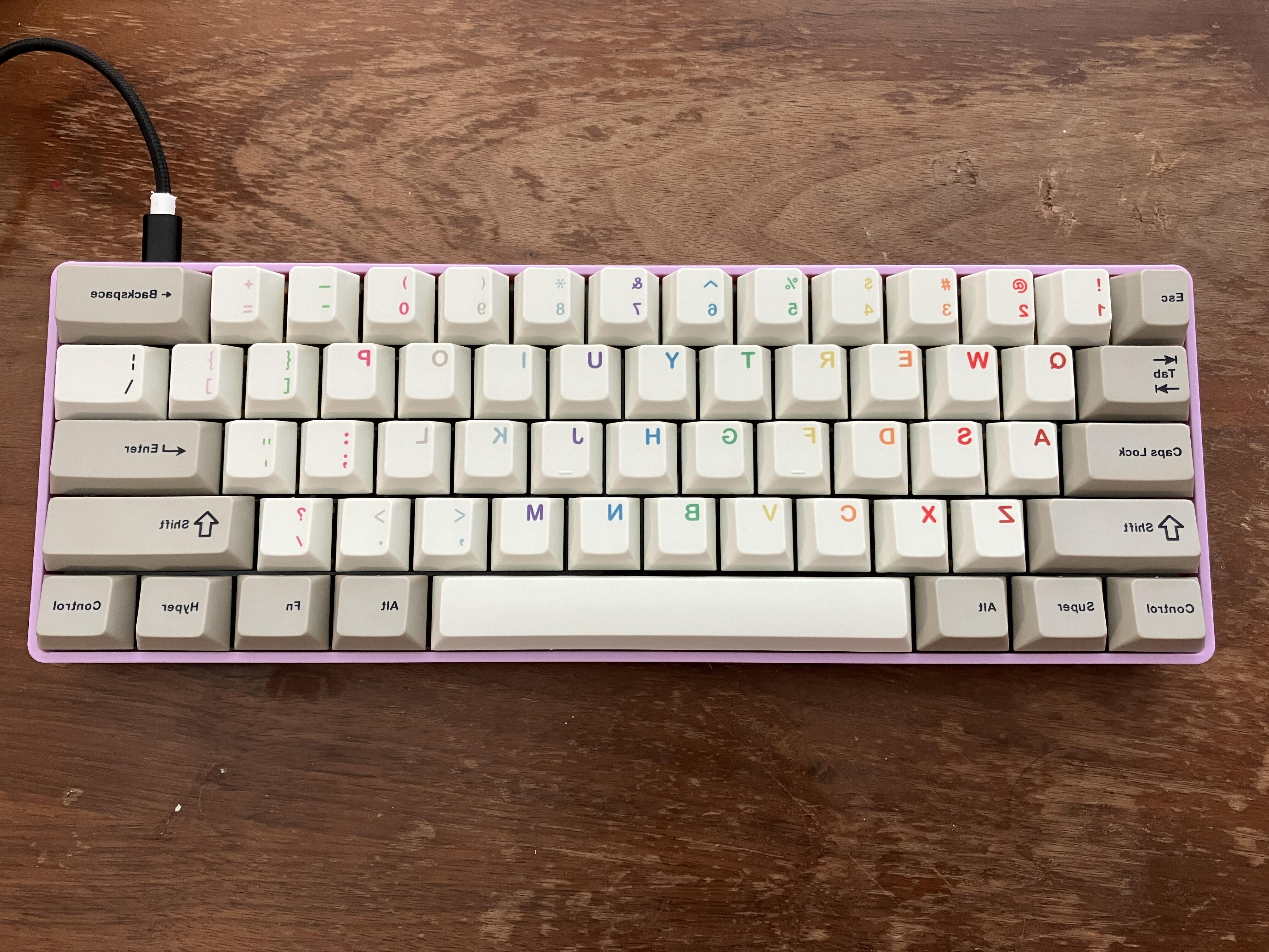
This next set is very aesthetic, but I can’t figure out the theme for the life of me. It has characters in all four quadrants of a keycap like a Chinese language keyboard.
But what does it mean? Is this how you pronounce the characters? Some of the words are straight English like out and back? Why?
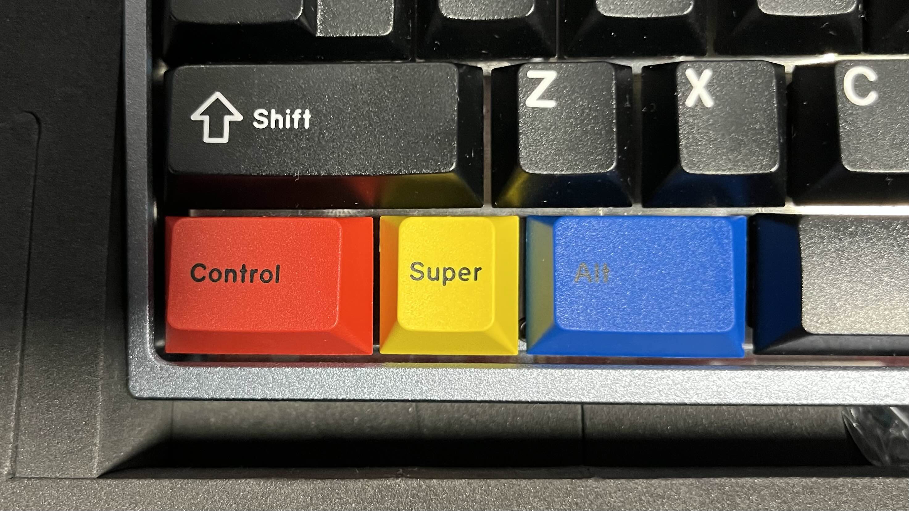
Looks like they’re clones of a Jaekeyed set. There’s a little bit of context on Cannonkeys, even if the copy is a bit overwrought IMHO. Gotta respect the marketing though, and it’s a nice set. In the intended layout on a 104, many of the English legends have a sort of dreamer’s thesaurus relationship to the normal legends or functions of the keys.
Gateron markets them as office switches, but they are long-pole. So they are LOUD. Yet,
"These switches are lightweight, ideal for long hours of comfortable typing without the intrusive clack, suitable for the quiet professionalism the office demands. "
These are actually great for typing, as advertised. A real alternative to MX Brown. But in no way are these quiet office switches.
Oh yeah USPS can get real funky with it sometimes. A few weeks ago I had my order for extra gaskets & screws for my XOX70 from NK got to frigging Salt Lake City before it got to me for some reason… now mind you I live in PA & Novelkeys is in WV, two bordering states…
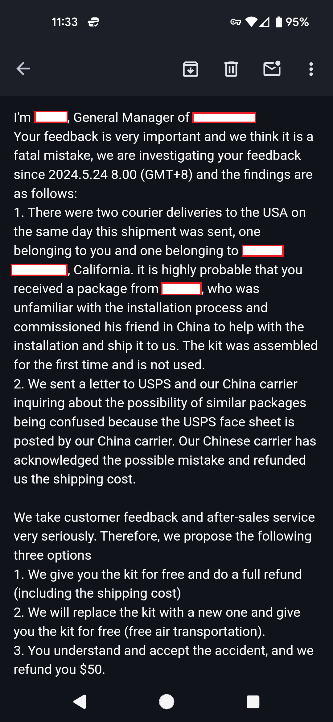
Man, I just can’t catch a break. 90% of anything keyboard related that I’ve ever ordered from overseas has arrived either damaged or incorrect. This time takes first prize. I received a partially assembled keyboard in a much abused box that had been further damaged in shipping. Please enjoy this convoluted cluster of an email response from Support.
Weird, but I suppose they’re talking, which is good. Something must be lost in translation, though, because I’m failing to see how 3 isn’t just a crappier version of 1.
The value on these AL / SK / 66 / 71 keebs is nothing short of amazing, but there are little things here and there that reveal their budget nature - like this Delete key from a completely different set of tooling than the rest of the stock keyset I think it might even be dyesub while the rest are doubleshot - but hey - it IS row correct, and this entire complete keyboard was less than 80 bucks. Less of a complaint and maybe more of a peek into how they pulled this off to begin with.
Completely agree on both points: 1) great switches and 2) loud AF. I’ve regularly brought in keyboards with fairly loud switches but even I think the Mini i would be a bit too much to ask of my coworkers’ patience. Anyone who buys these thinking they’ll be good for a quiet office is in for a surprise!
If your arcade is similar to the one near me, you may be able to pick up a $500 custom board for the same amount of money as it would take to get to 1450 tickets.
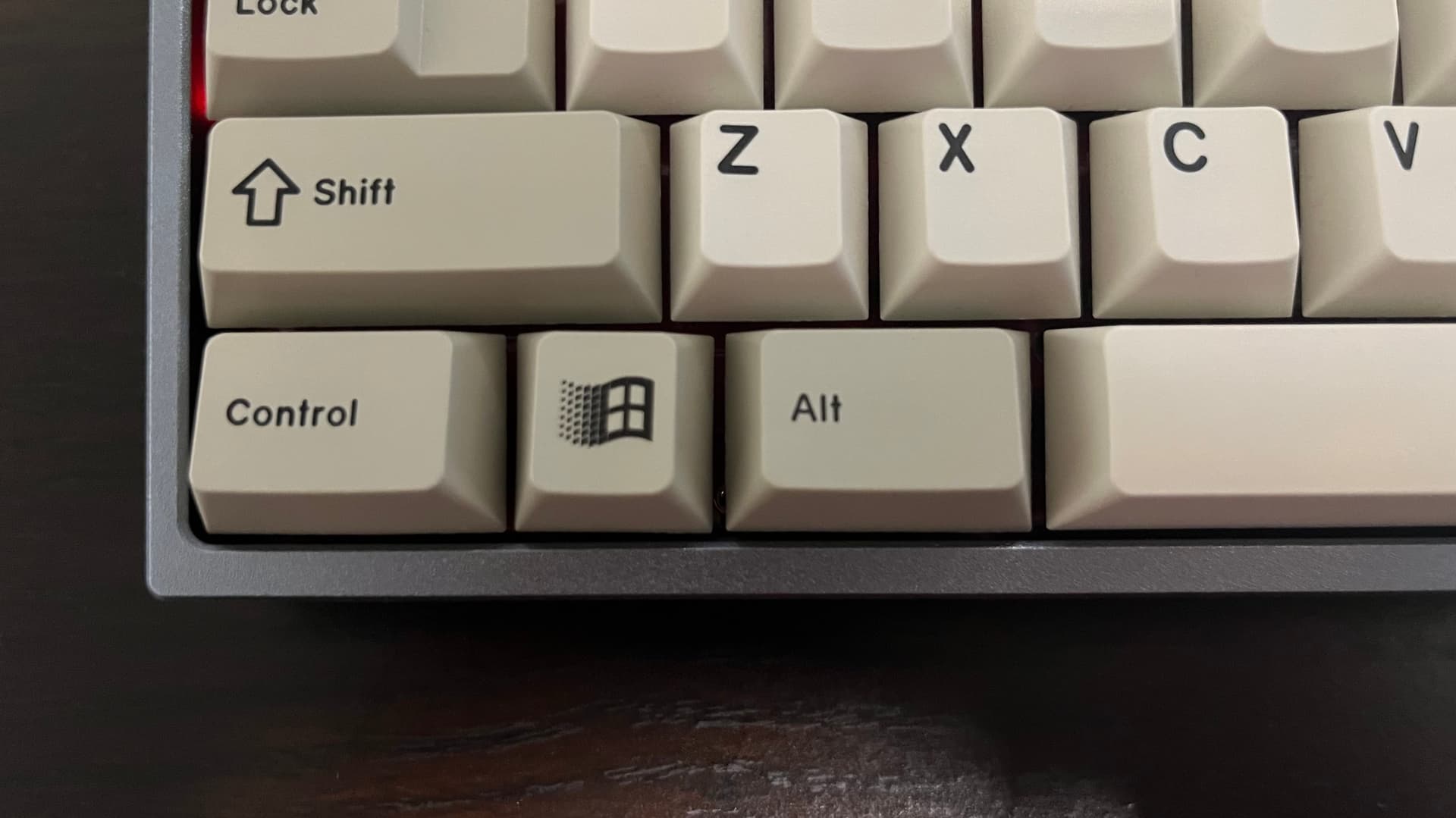
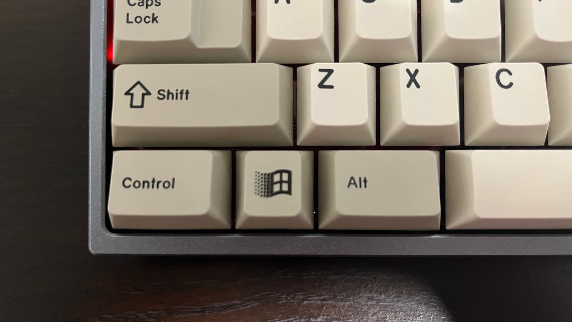
When I was doing a plateless build, I noticed my 1u winkey looked crooked and thought it was on me. After reflowing the solder and aligning it, the build looked perfect. That was until I took the keycaps off and swapped them, noticing how crooked it looks again.
While I’m still waiting for my replacement for Handarbeit R2, atleast most of my sets with R5 alt and ctrl keys aren’t crooked (except for GMK WoB Red Cyrillic which is slightly crooked but their “Sys” 1u is perfectly straight).
Ordered an open box WOB on Amazon, got a BOW. Set was just some Akko stuff and was half the usual price, and I like BOW perfectly fine, but it is annoying because I was really counting on being able to combine it with the extra super short spacebars from another black Akko set I have. I assume somebody else bought both and clicked the wrong one to return. Live by the Warehouse deal, die by the Warehouse deal, I guess.
Leaning towards keeping it, as this profile (SA-L) is out of stock now, and there are still some decent combinations by working with the leftovers from my other set, but it can’t be a clean WOB or BOW for the build I have in mind. Amazon being Amazon, I guess I just have to make up my mind in the next month to decide if I want my 20 bucks back, LOL.
I wonder if it’s a cached icon for some reason? I was curious so I inspected the source code for Drop and all of the favicons and touch icons all point to the “D” logo.