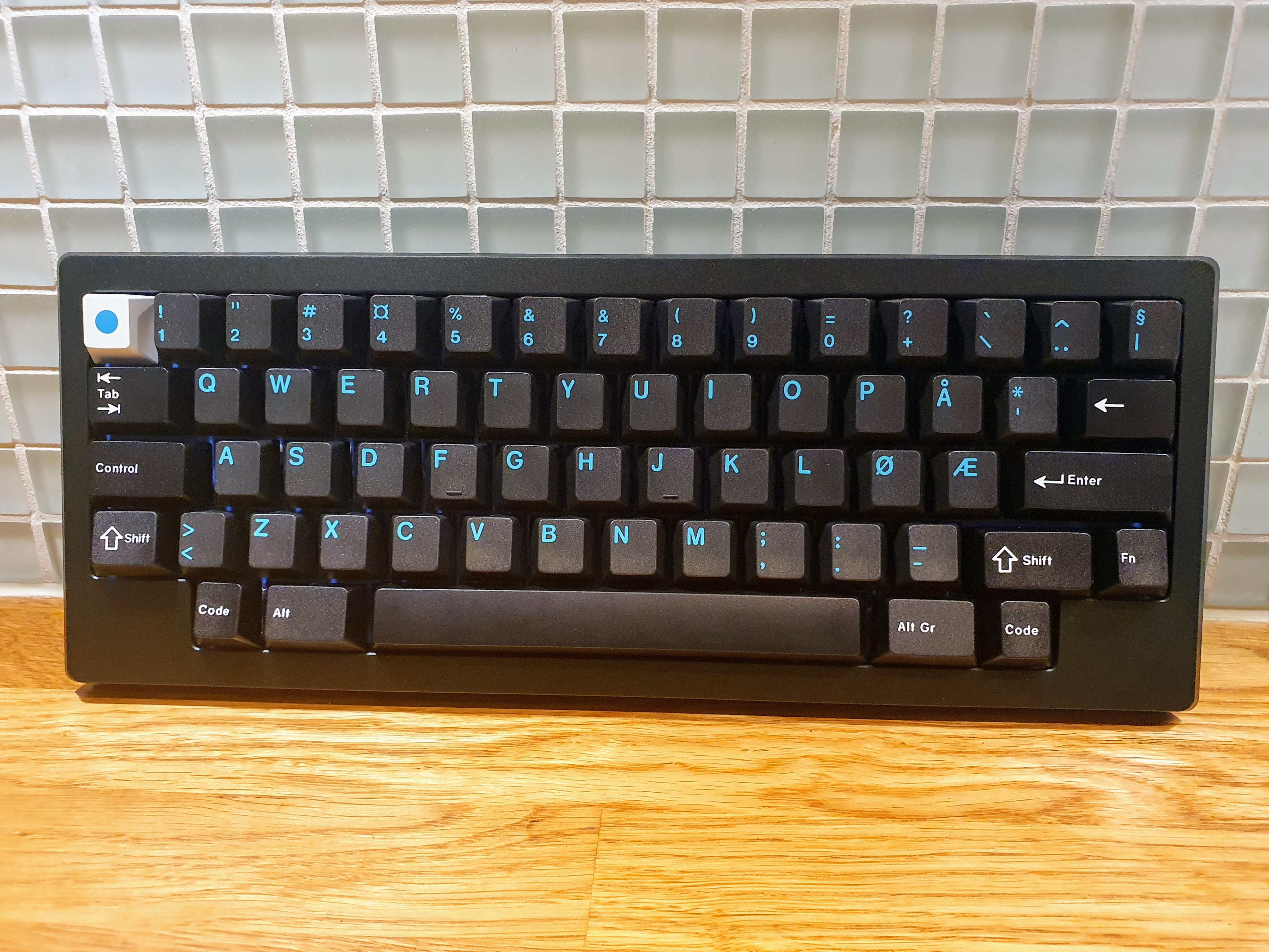
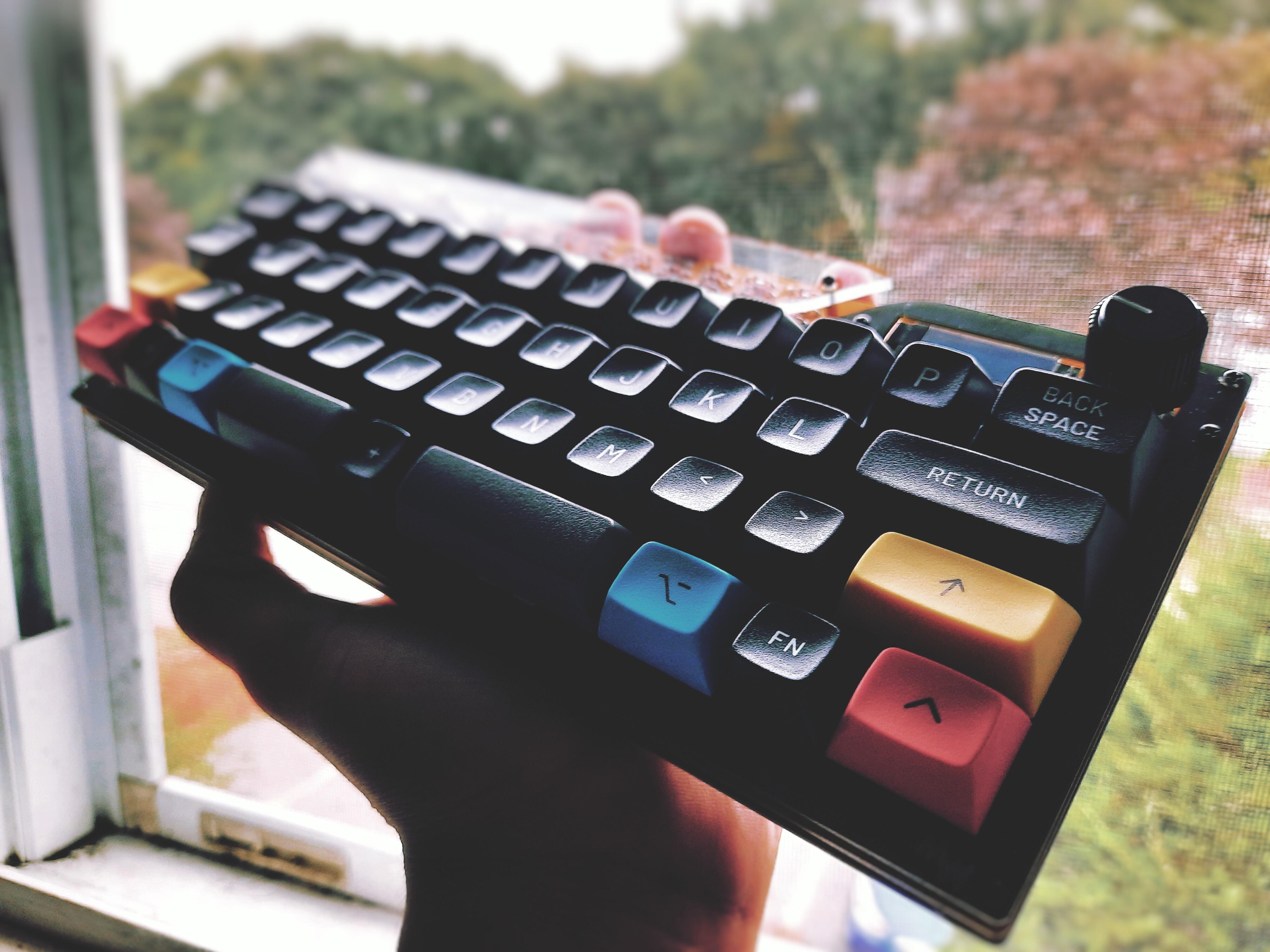
I love everyone’s mix and match sets. Some others I plan to mess with later but here’s JTK Zen Latin alphas/bars, GMK Magenta mods, and GMK WoB 40s. Kinda cursed but kinda alright
For my Meridian, I ended up needing to mix sets because I didn’t have the right kits from either. This is GMK Calm Depths alphas and GMK Solarized Dark modifiers.
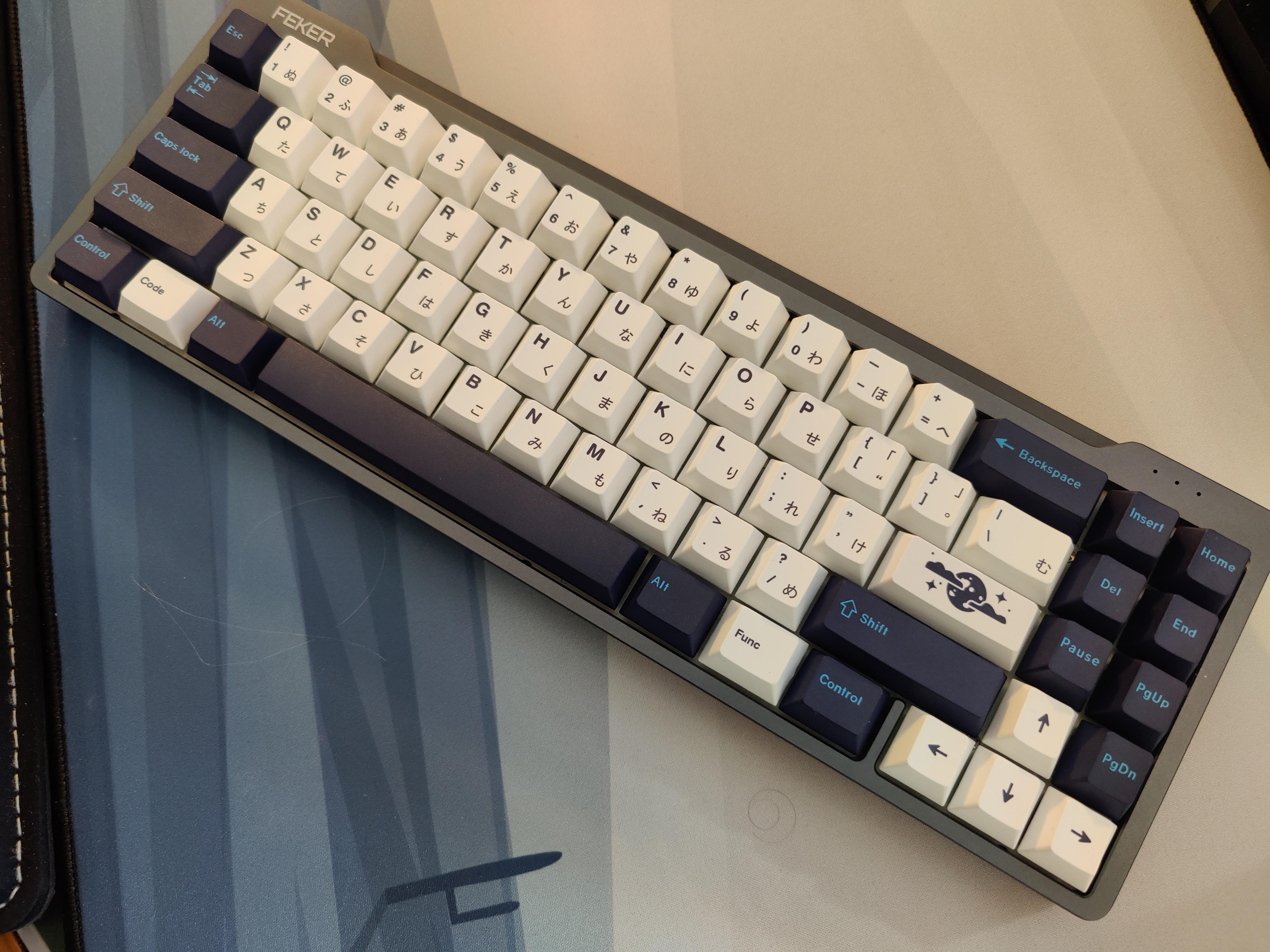
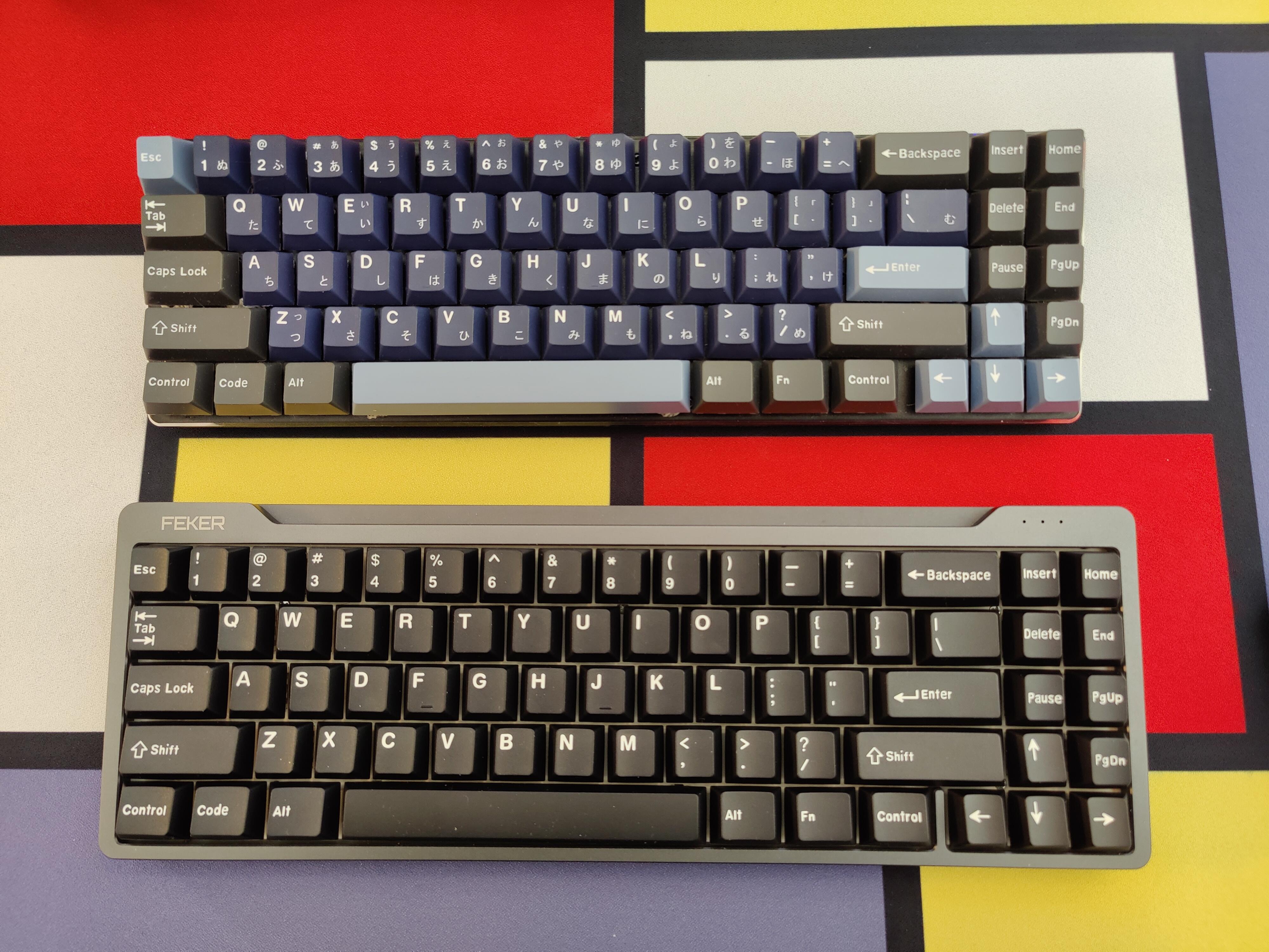
I was looking through my key caps when I realized I had some sets that I haven’t even tried yet… Including one that even had saran-wrap on the trays. Two of them were YMDK (I believe) Japanese sets: one set is white & light blue on dark blue, the other BoW. I thought they would look cool mixed together. So I tried this:
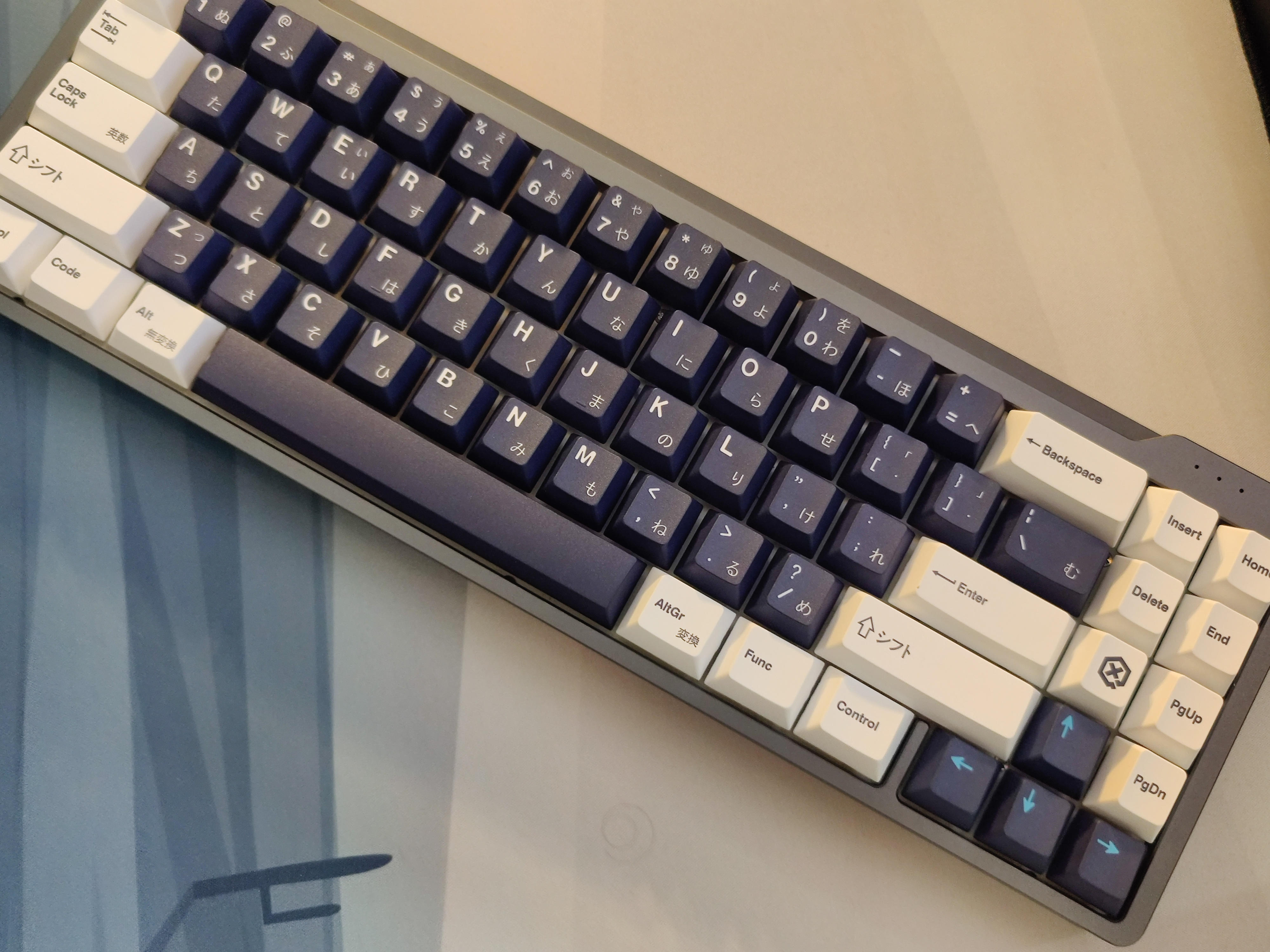
Now, it may not look bad to you, but after looking at this for a few minutes, I couldn’t take the modifiers anymore. There’s something about that Light Blue on Blue that just doesn’t work for me. But, I remembered that the alphas were white on blue, so I tried swapping them around, and this is the result:
The legends on the alphas are much larger than the legends on the modifiers, but that’s okay for me. There isn’t too big of a discrepancy in the font, or anything… Only thing is that I wish the arrow keys were white instead of light blue.
First post. I’ve been lurking this thread for months but was tired of bookmarking something every other page, so figured I could only fight my laziness for so much longer and joined.
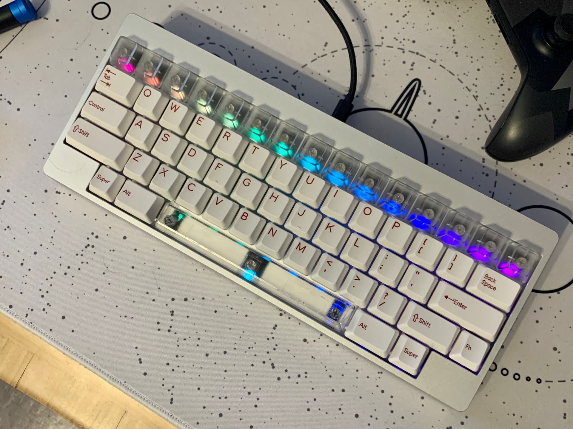
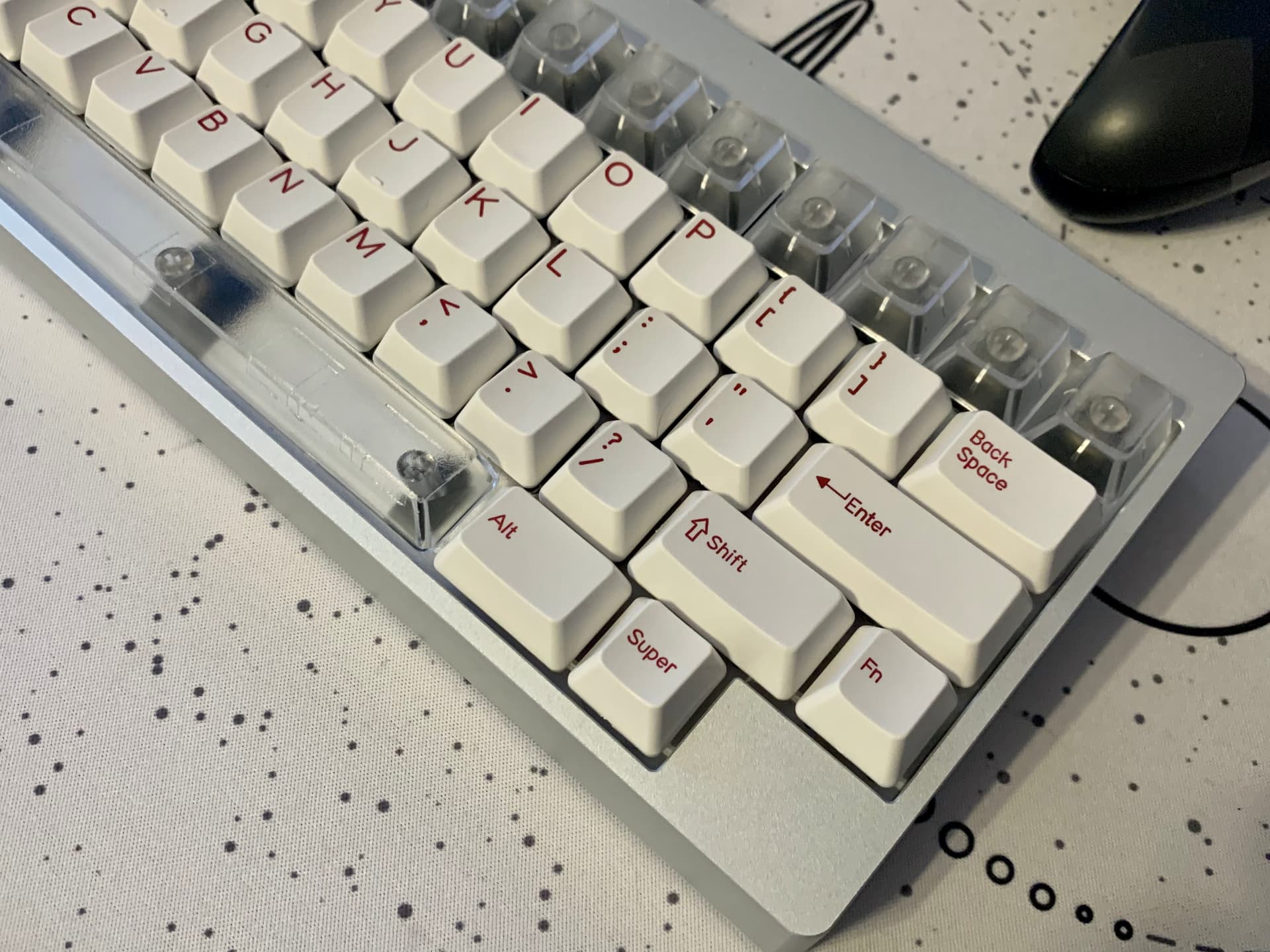
It’s a mix of MT3 WoB, Extended 2048 Accent mods + Susu bars.
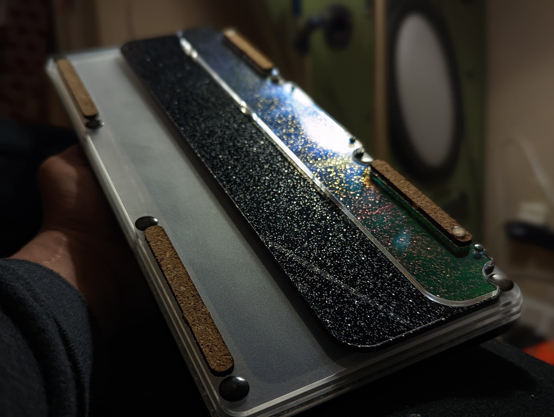
I have some higher quality & less-stylized shots somewhere, but couldn’t find them on my phone at the moment.
So, I had an inspiration the other day… I decided that I was going to put the KBDFans WoB on my Feker keyboard this weekend, but I had my Havit keyboard sitting here with the Arctic keycap set on it… So, I thought, what if I mixed the alphas from the Blue Hell set was taking off the Feker with the mods from the Arctic set? Here’s the result:
Personally, I like the look…I just wish that it didn’t have the Japanese sub-legends. It would be nice to have a set of pure White on Dark Blue key caps to use with something like this.
Yes, it is quite subtle. I kind of wish the dark blue had a bit more gray in it to make it even more subtle.
I tend to be into either really high contrast, or very subdued things. The middle ground tends to not appeal to me as much. I’m going to try a couple of things this weekend to see how they work (I have to build out a new keyboard so I’ll be experimenting a bit).
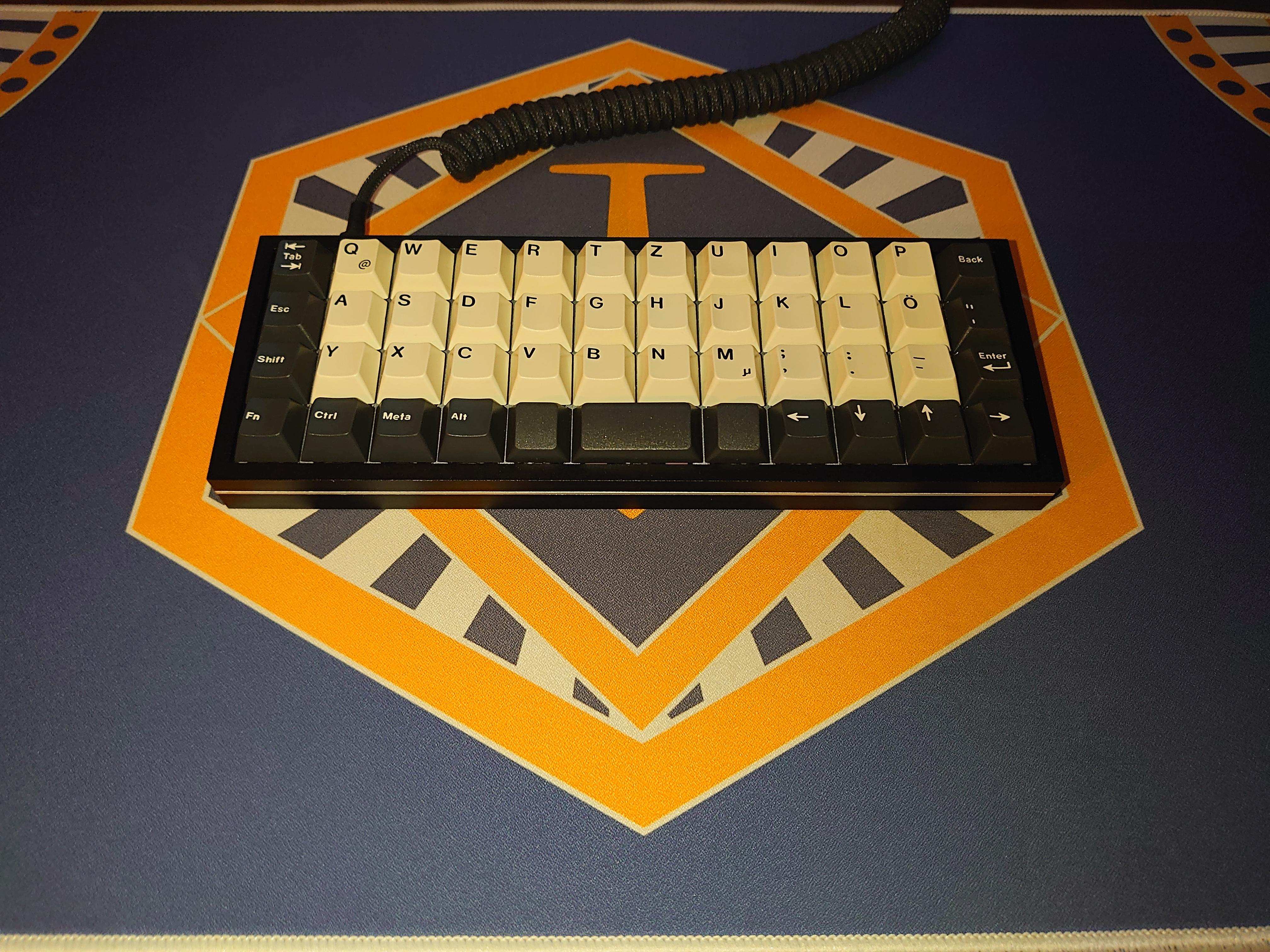
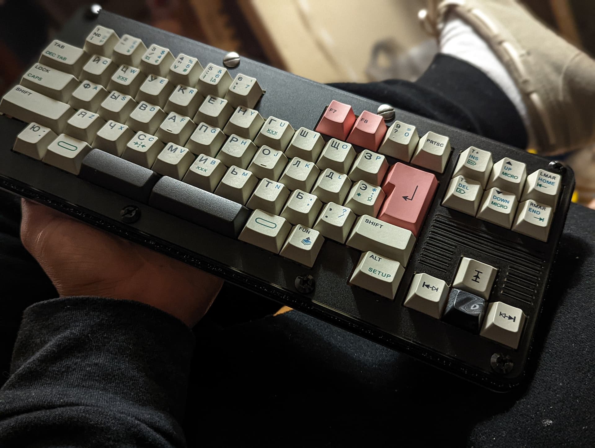
Haven’t done a mash-up in a while. I was a little non-commital so I only did one side to see how it would look.
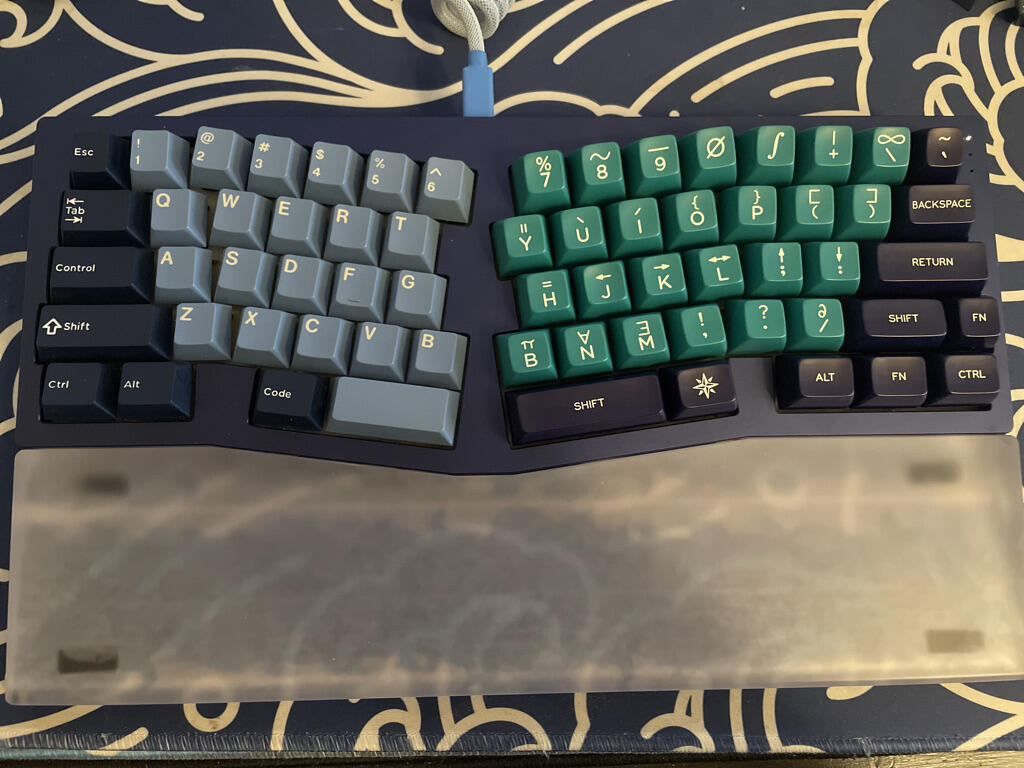
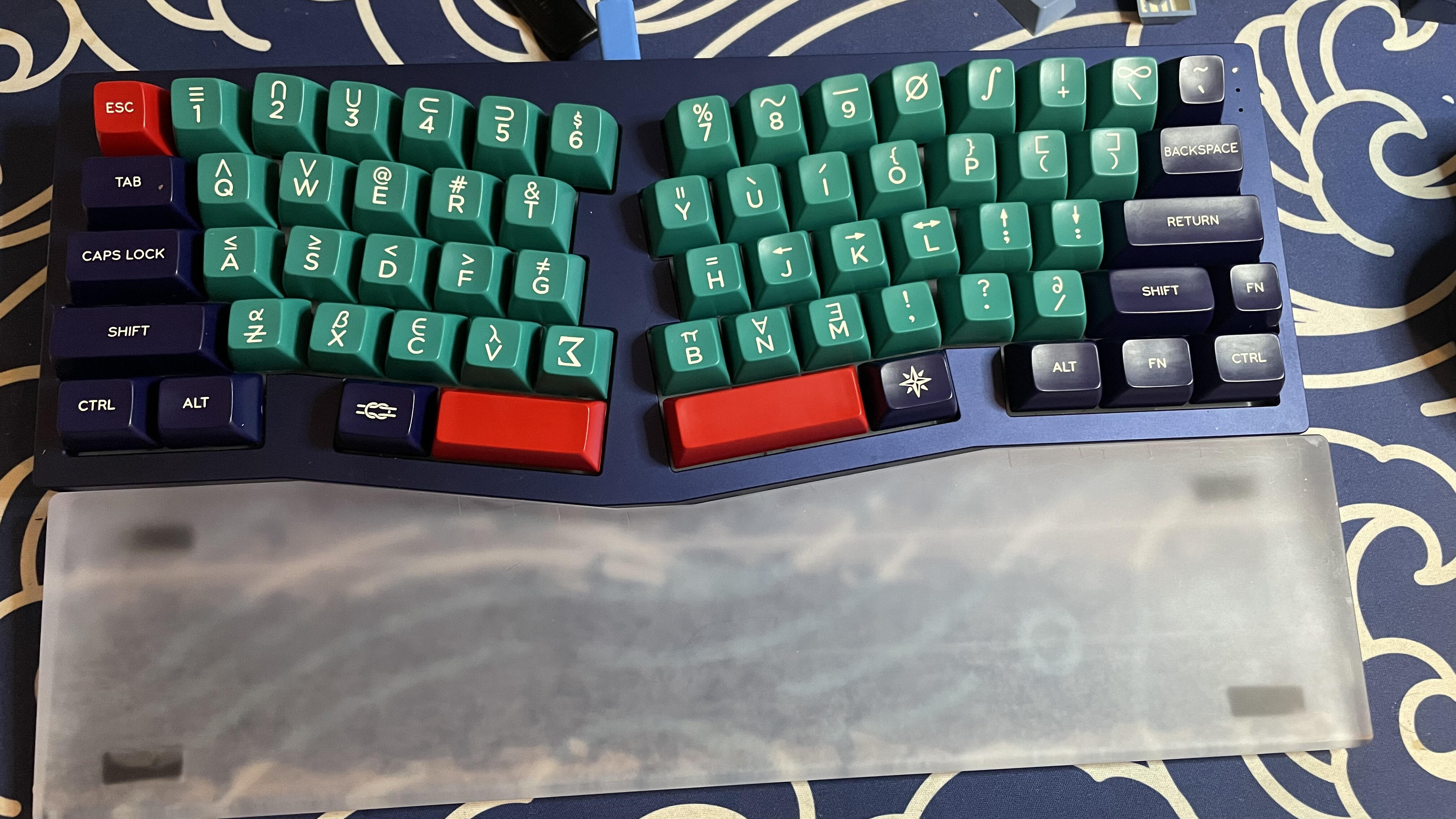
Unfortunately I didn’t get the 40s kit for SAIL and these R4 SA Royal Navy shifts aren’t very comfortable (guess I could flip them). Still looks pretty nice though, I think.