Now these Blaecks sound much more up my alley than Raeds! Is the manu still JWK? If so I gotta grab some of these. Nylon housings/POM stem/full travel are my fav JWK switches, toss in switches from fresh molds & you got a winner in my book!
25% off everything in stock at Omnitype today. A few GMK sets and lots of deskmats.
That’s what I needed to hear.
So…
I walked into a local computer store today (yup, ye olde brick-n’-mortar shop), and I learned two great things:
(1) Their prices are actually pretty equitable with Amazon, and the stock/variety was excellent
(2) They sell Keychron and Glorious boards that they mod in-house (even mods as recent as force-break), and they actually do a great job and make some great sounding boards
What a time to be alive…
Looks like Gateron’s own all-clear switch (aside from the Zeal Crystal) is now available, and they’re calling it the North Pole.
What makes this one different from all the others? Well, on paper it’s the Ink material stem - the rest is polycarb. That, and it’s Gateron - who at this point are known for having at least decent standards - that is, I couldn’t see them putting out something purely because it’s novel if it doesn’t work well. I’d like to think there’s a reason they didn’t join this particular bandwagon until now, and I’d like to think that reason is “because it’s ready”.
Oof tho I think I need to halt my switch acquisition for juuust a minute lol
I hear you on that >.>
Damn I didn’t know the stem was made of the Ink material thermoplastic on these. I was gonna order some awhile back, but passed cause the description of them didn’t mention anything about the Ink stem. I assumed they were regular PC housing, POM stem & like you I’ve been trying to slow down on buying switches unless there is something special about them. Now I am really wondering what an all Ink thermoplastic switch would feel like… LOL
Edit: Divinikey is sell these in 18 packs??? What a weird number for individual packs, wonder why they’re being sold like that?
Ink material thermoplastic
As a Cherry Black fan, I frankly didn’t like the sound of Ink material. It’s lower pitched but flat deadened sound that, like sound of hammer landing on concrete floor, just fails to be exciting.
It does seem weird at first, but it kinda made sense to me when I was trying to decide how many packs I wanted;
1 = 18 - just curious / single numpad or macro pad
2 = 36 - a couple numpads / macro pads
3 = 54 - 40%
4 = 72 - 65%, 60%
5 = 90 - TKL, 75%
6 = 108 - full size
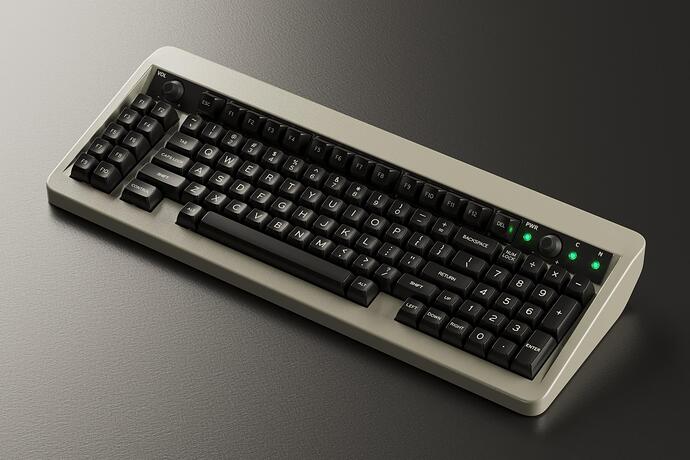
Holy cow is this ever a discount from the original, near $400 price… this is a heckuva deal on a classy 75%
I guess without a knob it just couldn’t compete, lol.
https://thekey.company/collections/clearance-items/products/godspeed75
Makes me wonder what’s the actual markup for these boards.
Well now that group buys are fulfilled by vendors and people are presumably paying taxes on the profit I think the average markup would be 100% - particularly shops like TKC, who make most of their money through limited run items and not in-stock items.
Same for RAMA - they order their boards in the 1000s now, which would make them so much cheaper to produce that they should be going down in price. Since they are building a business and paying staff and not some guy fulfilling orders out of boxes stacked in their garage, the prices go up instead.
The upside is you actually have a shot at a refund now.
same, although I want to know what they were thinking when TKC decided that was a good website redesign >.>


I guess they were tired of missing the mark on “classy” and decided to try missing the mark on “hip”  On the one hand it looks a little more like a developed brand (if that brand wanted to be instagram), but on the other it’s pretty garish - and personally, I’ve not been a fan of navigation menus off to the side since the days of Geocities and websites made of table cells.
Slow-day-at-work-design-school-ramble:
A little clunky and unresolved, but communicates “we make things” - and of course the keyboard formed by the factory windows. The perspective is mangled and it gets worse the longer you look at it, but to some degree I think there’s charm in that.
Between using “dot co” and the logo that looks a bit like London’s famous Battersea power station, I used to assume this was a UK business.
The whole aesthetic had a bit of an “arts district that used to be industrial” vibe; like a bookstore where artists and architects both get their coffee.
I wouldn’t call it a great logo, but it’s immediately recognizable.
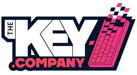
Leaves behind all the potential class and art house vibes that could come from the “former industrial district” look in favor of a more sneakers-and-synthwave aesthetic. (I’ll also note it now matches their actual domain name, which I see as an improvement.)
The color palette is basically instagram, which I guess fits the hobby well enough. I’d say it’s a little more well-resolved and professional looking than the previous one from a design perspective, but I also see some things that aren’t.
It has some thin-line details that get a bit lost at smaller sizes, and the HHKB-type graphic looks a little rushed, if better than the factory-window-keeb thing from the last one.
Realistically I think this one will serve them better as an expanding / growing business in the space, but if they stick around long enough, I do think there will be a time when this logo (and its associated brand aesthetic) will itself get a refresh.
An example of things being recognizable / getting lost at small sizes:
![]()
KeebTalk’s logo looses its individual little key dots, but is still totally recognizable as the overlapping rectangular speech bubbles with space bar. Google’s logo is completely recognizable. TKC’s is… pixel mud.
Were I a designer tasked with refreshing that logo, I’d try to find a way to keep the impression of that 16 x 16 pixel image while making it as legible / recognizable as possible at that size.
$#@! man, I didn’t even notice that. Lol.
Your comments are so spot on. They’re definitely targeting a certain demographic with their new logo and site design. The former feels sleek, mature, and refined. The latter looks like street art.
Yea, although tbf i dont get alot of design stuff or follow trends lol. Hell I wear gymshorts and 9/10 times a teeturtle shirt cause most of them are such moods
I see why they chose the new one, but I do prefer the old one - especially in terms of the website.
These days design is fun for me to think about - but going to design school had me… strongly disliking the trade for years. I kept the theory, but left the field aside from the occasional project I actually feel like doing - and hey! I actually like design again - as long as I steer far afield of “design culture”. ![]()
This reminds me of one of my (many) favorite songs:
Specifically:
In some fancy pants and a Stüssy hat
Just because I’m motha@#$%’ bringin’ ugly back
Proudly owning a crusty aesthetic is basically the vibe of the whole album, but I think this line sums it up well ![]()
