Concepts for Sub-30% Key and Layer Layouts?

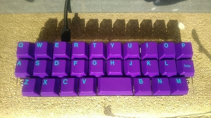
Earlier this year I built an Alpha (sometimes also called Alpha28), a 28-key keyboard by @PyroL, which I bought as kit from WorldspawnsKeebs on Etsy. (Yes, you can buy mechanical keyboards also on Etsy. :slightly_smiling_face:)

Originally I had GMK Paperwork by @evangs on it, but since I couldn’t show off any of its nice neon-pastell-ish modifiers on this board, I needed a different key cap set. And GMK Mitolet (was available as part of the GMK Pulse GB) by @MiTo has also colorful alphabetic keys and even gives it a kinda cyberpunk groove:

While @PyroL seems to have designed it for fun to make a keyboard with even less keys than the Gherkin, I consider it way more usable than the Gherkin due to its semi-stagger.

But you might wonder how one can type on such a sub-30% keyboard: It’s like playing that old children’s game “Memory”: The challenge is to remember where the special characters are hidden. :wink: (And you don’t call children playing “Memory” masochists, do you? :wink:)

And of course it runs QMK, so you can freely choose in advance where the special characters are.

WorldspawnsKeebs ships the keyboard kits in his keyboard shop on Etsy all with pre-flashed micro-controllers (What a service!), but I wasn’t happy with its default layout which has all the modifiers on its own layer, i.e. you need to press an Fn key to reach them. I also prefer to toggle layers only during holding a key. So I made up my own layout which I show and explain you below.

But I also wonder what other concepts beside the one being default for the Alpha (which I admittedly didn’t even fully grasp after reading the documentation) and mine.

So here’s my sub-30% layout concept:

  • Use all keys on tap as labelled by default.
  • Use different meanings on hold for the whole bottom row and some edge column keys.
  • Have all classic modifiers (Shift, Control, OS/Sys/Win, Alt/Meta) on the first layer twice (always only on hold), so that any key, even those with a modifier on hold, can be used with any modifier. (Example: Shift is on A hold and L hold so that Shift-A is holding L and then pressing A and Shift-L is holding A and then pressing L.)

How the keys are divided into layers:

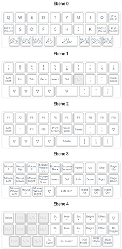
  • Layer 0: alphabetic keys, Space, Enter, and standard modifiers
  • Layer 1: numbers, special characters, and some more common other keys.
  • Layer 2: F-keys and less common other keys.
  • Layer 3: Cursor movement, scrolling, and mouse movement.
  • Layer 4: Configuring the RGB bling-bling and the QMK reset key.

So yes, even though the original layout doesn’t make use of the tap-or-hold feature of QMK, I have one layer more in my design. Then again, I think I really mapped all standard keys (but skipped media keys) while the original key map seems to miss a few seldom used keys like ScrollLock, PrintScreen, Pause/Break, etc. and also doesn’t incorporate mouse movement.

And here’s a picture of the exact layout I currently use on my Alpha:

What other key mapping concepts are out there for 25% to 30% keyboards?

Disclaimer: Yes, the photo at the beginning of the posting is the same as in my recent r/MK posting. But I think Reddit is not the proper place to discuss technical keyboard stuff. IMHO r/MK is not even not for Show and Tell. It’s just for Show and Get Upvotes. :wink: Hence posting the same picture here, too, just in a different context and especially with different expectations.
2 Likes

I wouldn’t worry too much about your disclaimer, I see pics that show up here in the what’s on your desk and post your keyboard threads show up in /r/mk pretty regularly and I don’t think anyone has any issue with that. I would agree this is def more of a place for discussion.

I don’t want to derail your thread, but I really don’t have much to contribute otherwise…

1 Like

I’ve recently been toying with the idea of taking the inner two columns, the ones which you have to move your index finger sideways to touch, and putting them on the thumbs to improve ergonomics. I like the size of 30% boards but the way most of the offerings disregard your thumbs entirely is a waste to me.

1 Like

Thanks. Just wasn’t sure. :slight_smile:

To my surprise the bigger layout discussion happened over there at r/MK. :crazy_face:

But not with an Alpha28 or any other close-to-traditional layout, do you?

I assume you’re rather toying with a complete new keyboard design for that.

You’ve got a point there. On the Alpha28, I seem to use the thumbs for most of the bottom row, though, only for Z I clearly use the pinky. For X and M I’m not sure if I use the thumbs or the pinkies more often.

So yes, I seem to use it spacebar-centred which fits with the slight offset of the alphabetic keys to the left on classic >60% keyboards — despite the home row is very symmetrical on the Alpha28.

…Are you supposed to put your fingers on the top row and use your thumbs on the bottom? I had my fingers resting on the traditional home row when I was using my Alpha and now I feel dumb.

To answer your question, yes, I was thinking about a whole new board to do this.

I don’t think so.

Me, too.

I don’t think you need to do that. :slight_smile:

It definitely feels more comfortable than cramming my thumbs up next to my index fingers. I’m going to do it like that from now on.

1 Like

You’ve got a point there.

Hehe. Not sure if that will happen for me, though.

This is a wild layout for a wild man :eyes:

I feel like once you get to the sub 40% range, you might want to consider the concept of chording for modifiers and punctuation :thinking:

3 Likes

LOL! Taking this as a compliment! :crazy_face:

Probably have to if I’ll go sub-25%.

Currently toying with ordering a Butterstick with 20 keys to have and try a keyboard where chording is necessary.

Then again, if I only take the concept of chorded typing for the (kinda missing) middle row, I probably could use a very similar layout as with the Alpha28 on the Butterstick, too. Just have to imagine it’s a Gherkin with missing middle row.

Already made a local chance purchase for a Ginny kit (or Ginni, the developer seems to not to be able to decide; 10 keys and ASETNIOP layout), but haven’t even built it yet.

Looking at the Butterstick default layout I though think that using a chorded typing layout also requires keycaps with a rather large surface to be able to press for keys at their intersection, i.e. flat surface keycaps as common for Kailh Choc switches. This is clearly not comfortable with e.g. Cherry profile and probably neither with SA or OEM profiles. Not sure about DSA, KAM and KAT, though. MDA might work, too.

And do never ever use some of these “typewriter-style keycaps” for that. You’ll hurt yourself as I did as a child when trying to type on my grandpa’s mechanical travel typewriter and not hitting the keys properly. :cry:

I’ve just had a thought: if you got a Gherkin/Miuni32 and chorded the top two rows like the butterstick, and did the whole top home row + thumbs on bottom thing, you’d have basically a smol Planck

1 Like

Yep, except that IIRC the Gherkin is 3Ă—10 while the Planck is 4Ă—12.

Actually, while using the Alpha28 today to work on some Raspberry Pi cluster in my living room (homeoffice replacement for my Raspberry Pi “lab cluster” at work), I noticed that there’s a completely different way to use the Alpha28:

I was holding it like a gamepad, mostly typing with the thumbs. Doesn’t work that well with layer shifting on hold, though. So I’m now thinking how this minimal key set can be used even without tap-or-hold. So I might revisiting the ideas of the original developer with regards to modifiers. (Not sure if he did it that way because of this, though.)

Wait. What if you added switches to the back for your other digits? Like a key you could hold with left or right pinky for a layer each while your thumbs did the heavy lifting up top? You could possibly have keys on the back like triggers on a console controller taht could access macros, or layers, or whatever. :thinking:

Could work if I just add a second Alpha28 on the back as it’s more or less symmetric.

More difficult as the case is a two-layer acrylic sandwich case. :slight_smile:

But in general you’re right. Although I think a dedicated layout would be probably more satisfying. :thinking:

I imagine more something like the Reviung39 as base layout with the wing tip (edge) keys being on the the back.

We probably could do this in acrylic two layer case design, too, with both layers being plates and a single PCB in the middle, populated with switches from both sides.

Just checked which keys on the Alpha28 I can reach comfortably with the thumbs (and I do have rather small hands):

  • Top row RTYU and middle row GH are difficult to reach.
  • Z and M are actually below my palm already.

I though could reach one more outer column on each side for at least the top row, probably also the middle row. And I could reach two—maybe front facing—keys below the bottom row.

Will try to make up a layout with KLE. Not sure if I can manage to visualize the backside keys properly. :man_shrugging:

We’d also need a kind of resting socket or so to not needing to put the keyboard down and laying the key cap tops onto a table.

Hey, we’re on to somerhing! :crazy_face:

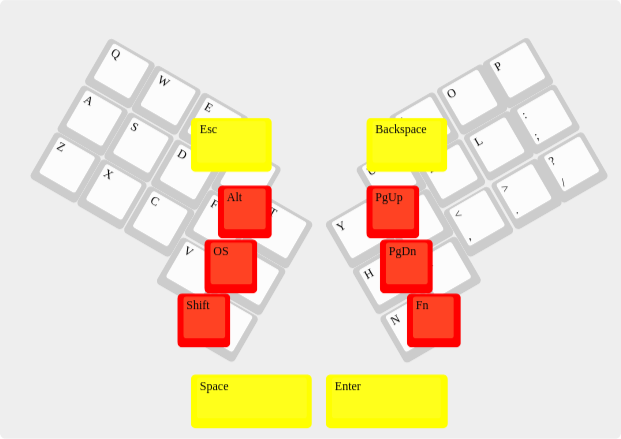
First try, I called it Thumbwing:

Thumbwing

layout in JSON format

Red are backside keys, yellow are shoulder and belly keys. The belly keys are probably mounted in the same plate as the normal keys, just with keycaps mounted 180° turned, so that they have the surface showing more towards the belly. The same might work with the shoulder keys.

The partially covered remainders are the standard columnar staggered rows 2 to 4 taken from an Atreus (as it was available as preset in KLE), but with 30° turned instead of just 10°.

The idea is that at least the index fingers are not resting on the backside but on the keyboard’s shoulders to keep the keyboard from slipping out of your hands. (I should probably move the shoulder keys more to the outer edges, my index fingers aren’t that long.)

Might need to add more keys on the back side. Especially the pinky can easily reach two columns of backside keys.

Unfortunately this probably won’t work that easily for a hand-wired build.

Ah, and regarding the key profile for the back side keys. I can imagine Cherry profile, probably R3 and 90° turned i.e. bottom side pointing to the sides, but also non-sculpted like DSA and XDA. And also Choc switches and key caps. The latter might even fix that socket issue I mentioned, but instead make it more difficult to blindly find the keys.

EDIT: As promised, I added the Thumbwing design to my keyboard designs Github repository.

P.S.: I can’t simply post a link to the layout loaded in KLE as I did before since KLE—as soon as I don’t edit the raw code manually but click inside the layout—will move the colored keys to the background and they can’t be seen anymore. Added it as a link to Github retroactively.